

AI Generated image: House Price predictions
This project offers a hands-on visual exploration of linear regression for predicting house prices. It emphasizes cost function intuition, gradient computation, and model fitting through rich 2D and 3D interactive visualizations.
This project showcases an interactive machine learning model that predicts house prices based on features such as size. Inspired by the DeepLearning.ai labs during my training under Stanford University's Machine Learning course on Coursera, this project highlights key Macchine Learning concepts like cost functions, gradient descent, and interactive visualizations. By redefining and recreating tools from the lab environment, I successfully reproduced the project on local systems, ensuring it works seamlessly outside the proprietary lab setup.
This project explores linear regression and its application to predicting house prices. The model learns the relationship between house size (input) and price (output) using a cost function that measures the error in predictions. Key highlights of the project include:
VIDEO Created during my exercises in ML Lab Lessons.
Interactive visualization of linear regression.
Clicking on right Contour graph, house
prediction line graph at the reflect the changes.
RUN VIDEO: click on play icon
Interactive plots demonstrate the impact of different parameters (w, b)
on the cost function. Users can:
Codes representing in 19 number of Jupyter Notebook cells
Cell 1: Importing Required Libraries and Defining
Plot Colors:
This cell begins by importing the essential Python libraries used throughout the
notebook. numpy is imported for numerical computations, and matplotlib.pyplot
is included for data visualization and plotting.
Additionally, five custom color codes are defined (such as dlblue, dlorange,
and dlpurple) which will be used consistently for styling graphs and plots. These colors
are sourced from lab_utils_common.py, typically used in DeepLearning.AI courses for clean
and informative visuals.
Defining them early helps maintain visual consistency in plots across the notebook.
          import numpy as np
          import matplotlib.pyplot as plt

          dlblue = '#0096ff'
          dlorange = '#FF9300'
          dldarkred = '#C00000'
          dlmagenta = '#FF40FF'
          dlpurple = '#7030A0'
          dlcolors = [dlblue, dlorange, dldarkred, dlmagenta, dlpurple]
This cell defines the compute_cost_matrix function, which calculates the
cost (or loss) of a linear regression model.
It accepts input features X, target values y, model weights w, and
bias b. The cost is computed using the Mean Squared Error (MSE) formula,
which measures how far off the predicted values are from the actual values.
The function predicts output values using vectorized operations (f_wb = X @ w + b) and
computes the average squared error. An optional verbose flag can be set to True
to print the predictions for debugging.
          #Function to calculate the cost
          def compute_cost_matrix(X, y, w, b, verbose=False):
              """
              Computes the gradient for linear regression
              Args:
                X (ndarray (m,n)): Data, m examples with n features
                y (ndarray (m,)) : target values
                w (ndarray (n,)) : model parameters
                b (scalar)       : model parameter
                verbose : (Boolean) If true, print out intermediate value f_wb
              Returns
                cost: (scalar)
              """
              m = X.shape[0]

              # calculate f_wb for all examples.
              f_wb = X @ w + b
              # calculate cost
              total_cost = (1/(2*m)) * np.sum((f_wb-y)**2)

              if verbose: print("f_wb:")
              if verbose: print(f_wb)

              return total_cost
This cell defines the compute_gradient_matrix function, used to calculate the gradients
of the cost function with respect to the weights w and bias b.
The function takes the input data X, actual target values y, and current model
parameters w and b. It computes the prediction error and then calculates:
dj_dw: The gradient of the cost with respect to weights.dj_db: The gradient of the cost with respect to bias.These gradients are used in gradient descent to update the parameters and minimize the prediction error.
        def compute_gradient_matrix(X, y, w, b):
          """
          Computes the gradient for linear regression

          Args:
            X (ndarray (m,n)): Data, m examples with n features
            y (ndarray (m,)) : target values
            w (ndarray (n,)) : model parameters
            b (scalar)       : model parameter
          Returns
            dj_dw (ndarray (n,1)): The gradient of the cost w.r.t. the parameters w.
            dj_db (scalar):        The gradient of the cost w.r.t. the parameter b.

          """
          m,n = X.shape
          f_wb = X @ w + b
          e   = f_wb - y
          dj_dw  = (1/m) * (X.T @ e)
          dj_db  = (1/m) * np.sum(e)

          return dj_db,dj_dw
This cell defines the compute_cost function, which calculates the cost using a
loop-based approach instead of vectorized operations.
For each training example, the model computes a prediction f_wb_i using dot product and
bias, then compares it with the actual target value y[i].
The squared differences are summed up and averaged to return the mean squared error as the cost. Though
less efficient, this approach improves understanding and is useful for debugging.
          # Loop version of multi-variable compute_cost
          def compute_cost(X, y, w, b):
              """
              compute cost
              Args:
                X (ndarray (m,n)): Data, m examples with n features
                y (ndarray (m,)) : target values
                w (ndarray (n,)) : model parameters
                b (scalar)       : model parameter
              Returns
                cost (scalar)    : cost
              """
              m = X.shape[0]
              cost = 0.0
              for i in range(m):
                  f_wb_i = np.dot(X[i],w) + b           #(n,)(n,)=scalar
                  cost = cost + (f_wb_i - y[i])**2
              cost = cost/(2*m)
              return cost
This cell defines the compute_gradient function that calculates the gradients of the cost
function with respect to weights w and bias b.
Using nested loops, it iterates over each training example to compute the prediction error and updates
each weight's partial derivative dj_dw and the bias gradient dj_db.
After looping through all examples, the gradients are averaged. This implementation builds foundational
understanding of gradient descent mechanics despite being less efficient than vectorized alternatives.
        def compute_gradient(X, y, w, b):
          """
          Computes the gradient for linear regression
          Args:
            X (ndarray (m,n)): Data, m examples with n features
            y (ndarray (m,)) : target values
            w (ndarray (n,)) : model parameters
            b (scalar)       : model parameter
          Returns
            dj_dw (ndarray Shape (n,)): The gradient of the cost w.r.t. the parameters w.
            dj_db (scalar):             The gradient of the cost w.r.t. the parameter b.
          """
          m,n = X.shape           #(number of examples, number of features)
          dj_dw = np.zeros((n,))
          dj_db = 0.

          for i in range(m):
              err = (np.dot(X[i], w) + b) - y[i]
              for j in range(n):
                  dj_dw[j] = dj_dw[j] + err * X[i,j]
              dj_db = dj_db + err
          dj_dw = dj_dw/m
          dj_db = dj_db/m

          return dj_db,dj_dw
This cell sets up the environment for visualizing univariate regression tasks. It imports key libraries
like NumPy, Matplotlib, and ipywidgets for plotting and
interactivity.
The default plot style is applied for consistency, and a custom color map dlcm is created
using LinearSegmentedColormap with five color bins.
These utilities support interactive and colorful plots for illustrating model predictions, cost function
surfaces, and gradient flows during learning, enhancing both clarity and user interaction.
        #lab_utils_uni.py routines used in Course 1, Week2, labs1-3 dealing with single variables (univariate)
        # Combined content of lab_utils_uni.py

        import numpy as np
        import matplotlib.pyplot as plt
        from matplotlib.ticker import MaxNLocator
        from matplotlib.gridspec import GridSpec
        from matplotlib.colors import LinearSegmentedColormap
        from ipywidgets import interact
        #from lab_utils_common import compute_cost
        #from lab_utils_common import dlblue, dlorange, dldarkred, dlmagenta, dlpurple, dlcolors

        #plt.style.use('./deeplearning.mplstyle')
        plt.style.use('default')  # Use a default style temporarily
        n_bin = 5
        dlcm = LinearSegmentedColormap.from_list('dl_map', dlcolors, N=n_bin)
This cell provides two custom plotting functions to enhance the interpretability of linear regression outputs in housing data:
'x' markers. If model predictions f_wb are passed, it overlays a
prediction line in blue, with axis labels and a legend.These visualizations are essential for understanding model behavior, particularly how predictions compare to actual data and how cost is computed across the dataset.
        # Plotting Routines

        def plt_house_x(X, y,f_wb=None, ax=None):
            ''' plot house with aXis '''
            if not ax:
                fig, ax = plt.subplots(1,1)
            ax.scatter(X, y, marker='x', c='r', label="Actual Value")

            ax.set_title("Housing Prices")
            ax.set_ylabel('Price (in 1000s of dollars)')
            ax.set_xlabel(f'Size (1000 sqft)')
            if f_wb is not None:
                ax.plot(X, f_wb,  c=dlblue, label="Our Prediction")
            ax.legend()


        def mk_cost_lines(x,y,w,b, ax):
            ''' makes vertical cost lines'''
            cstr = "cost = (1/m)*("
            ctot = 0
            label = 'cost for point'
            addedbreak = False
            for p in zip(x,y):
                f_wb_p = w*p[0]+b
                c_p = ((f_wb_p - p[1])**2)/2
                c_p_txt = c_p
                ax.vlines(p[0], p[1],f_wb_p, lw=3, color=dlpurple, ls='dotted', label=label)
                label='' #just one
                cxy = [p[0], p[1] + (f_wb_p-p[1])/2]
                ax.annotate(f'{c_p_txt:0.0f}', xy=cxy, xycoords='data',color=dlpurple,
                    xytext=(5, 0), textcoords='offset points')
                cstr += f"{c_p_txt:0.0f} +"
                if len(cstr) > 38 and addedbreak is False:
                    cstr += "\n"
                    addedbreak = True
                ctot += c_p
            ctot = ctot/(len(x))
            cstr = cstr[:-1] + f") = {ctot:0.0f}"
            ax.text(0.15,0.02,cstr, transform=ax.transAxes, color=dlpurple)
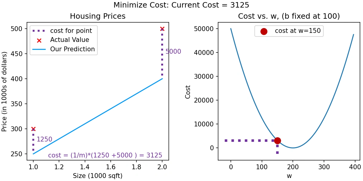
This cell introduces the plt_intuition() function, which uses an interactive widget to
demonstrate how the cost changes as the model weight w is varied, while keeping the
bias b fixed at 100.
w values is defined
around 200, and the corresponding cost is calculated using compute_cost().@interact, a slider is provided to
dynamically select w values. For each selection:
This visualization is a valuable tool for intuitively understanding the gradient descent process and the impact of the weight parameter on model performance.
        # Cost lab
        ##########

        def plt_intuition(x_train, y_train):

            w_range = np.array([200-200,200+200])
            tmp_b = 100

            w_array = np.arange(*w_range, 5)
            cost = np.zeros_like(w_array)
            for i in range(len(w_array)):
                tmp_w = w_array[i]
                cost[i] = compute_cost(x_train, y_train, tmp_w, tmp_b)

            @interact(w=(*w_range,10),continuous_update=False)
            def func( w=150):
                f_wb = np.dot(x_train, w) + tmp_b

                fig, ax = plt.subplots(1, 2, constrained_layout=True, figsize=(8,4))
                fig.canvas.toolbar_position = 'bottom'

                mk_cost_lines(x_train, y_train, w, tmp_b, ax[0])
                plt_house_x(x_train, y_train, f_wb=f_wb, ax=ax[0])

                ax[1].plot(w_array, cost)
                cur_cost = compute_cost(x_train, y_train, w, tmp_b)
                ax[1].scatter(w,cur_cost, s=100, color=dldarkred, zorder= 10, label= f"cost at w={w}")
                ax[1].hlines(cur_cost, ax[1].get_xlim()[0],w, lw=4, color=dlpurple, ls='dotted')
                ax[1].vlines(w, ax[1].get_ylim()[0],cur_cost, lw=4, color=dlpurple, ls='dotted')
                ax[1].set_title("Cost vs. w, (b fixed at 100)")
                ax[1].set_ylabel('Cost')
                ax[1].set_xlabel('w')
                ax[1].legend(loc='upper center')
                fig.suptitle(f"Minimize Cost: Current Cost = {cur_cost:0.0f}", fontsize=12)
                plt.show()
The plt_stationary() function visualizes how the cost varies across different values of
weight w and bias b in linear regression. It provides three coordinated subplots:
w=200 and b=-100. Visual error lines illustrate the difference between predictions and actual values.
log(J(w, b)) using a color gradient. A blue dot and dotted lines indicate the current parameter values.
w and b. The 3D view can be rotated.
This function is an excellent tool to develop geometric and intuitive understanding of how gradient
descent would move over the cost surface to minimize J(w, b).
        def plt_stationary(x_train, y_train):
          # setup figure
          fig = plt.figure( figsize=(9,8))
          #fig = plt.figure(constrained_layout=True,  figsize=(12,10))
          fig.set_facecolor('#ffffff') #white
          fig.canvas.toolbar_position = 'top'
          #gs = GridSpec(2, 2, figure=fig, wspace = 0.01)
          gs = GridSpec(2, 2, figure=fig)
          ax0 = fig.add_subplot(gs[0, 0])
          ax1 = fig.add_subplot(gs[0, 1])
          ax2 = fig.add_subplot(gs[1, :],  projection='3d')
          ax = np.array([ax0,ax1,ax2])

          #setup useful ranges and common linspaces
          w_range = np.array([200-300.,200+300])
          b_range = np.array([50-300., 50+300])
          b_space  = np.linspace(*b_range, 100)
          w_space  = np.linspace(*w_range, 100)

          # get cost for w,b ranges for contour and 3D
          tmp_b,tmp_w = np.meshgrid(b_space,w_space)
          z=np.zeros_like(tmp_b)
          for i in range(tmp_w.shape[0]):
              for j in range(tmp_w.shape[1]):
                  z[i,j] = compute_cost(x_train, y_train, tmp_w[i][j], tmp_b[i][j] )
                  if z[i,j] == 0: z[i,j] = 1e-6

          w0=200;b=-100    #initial point
          ### plot model w cost ###
          f_wb = np.dot(x_train,w0) + b
          mk_cost_lines(x_train,y_train,w0,b,ax[0])
          plt_house_x(x_train, y_train, f_wb=f_wb, ax=ax[0])

          ### plot contour ###
          CS = ax[1].contour(tmp_w, tmp_b, np.log(z),levels=12, linewidths=2, alpha=0.7,colors=dlcolors)
          ax[1].set_title('Cost(w,b)')
          ax[1].set_xlabel('w', fontsize=10)
          ax[1].set_ylabel('b', fontsize=10)
          ax[1].set_xlim(w_range) ; ax[1].set_ylim(b_range)
          cscat  = ax[1].scatter(w0,b, s=100, color=dlblue, zorder= 10, label="cost with \ncurrent w,b")
          chline = ax[1].hlines(b, ax[1].get_xlim()[0],w0, lw=4, color=dlpurple, ls='dotted')
          cvline = ax[1].vlines(w0, ax[1].get_ylim()[0],b, lw=4, color=dlpurple, ls='dotted')
          ax[1].text(0.5,0.95,"Click to choose w,b",  bbox=dict(facecolor='white', ec = 'black'), fontsize = 10,
                      transform=ax[1].transAxes, verticalalignment = 'center', horizontalalignment= 'center')

          #Surface plot of the cost function J(w,b)
          ax[2].plot_surface(tmp_w, tmp_b, z,  cmap = dlcm, alpha=0.3, antialiased=True)
          ax[2].plot_wireframe(tmp_w, tmp_b, z, color='k', alpha=0.1)
          plt.xlabel("$w$")
          plt.ylabel("$b$")
          ax[2].zaxis.set_rotate_label(False)
          ax[2].xaxis.set_pane_color((1.0, 1.0, 1.0, 0.0))
          ax[2].yaxis.set_pane_color((1.0, 1.0, 1.0, 0.0))
          ax[2].zaxis.set_pane_color((1.0, 1.0, 1.0, 0.0))
          ax[2].set_zlabel("J(w, b)\n\n", rotation=90)
          plt.title("Cost(w,b) \n [You can rotate this figure]", size=12)
          ax[2].view_init(30, -120)

          return fig,ax, [cscat, chline, cvline]
plt_update_onclick
This class adds interactivity to the static plots from plt_stationary() by letting users
click on the contour plot to choose different values for the weight w and
bias b.
This tool turns the cost function plots into an interactive dashboard for exploring how changes in
w and b affect the model and its cost.
        #https://matplotlib.org/stable/users/event_handling.html
        class plt_update_onclick:
            def __init__(self, fig, ax, x_train,y_train, dyn_items):
                self.fig = fig
                self.ax = ax
                self.x_train = x_train
                self.y_train = y_train
                self.dyn_items = dyn_items
                self.cid = fig.canvas.mpl_connect('button_press_event', self)

            def __call__(self, event):
                if event.inaxes == self.ax[1]:
                    ws = event.xdata
                    bs = event.ydata
                    cst = compute_cost(self.x_train, self.y_train, ws, bs)

                    # clear and redraw line plot
                    self.ax[0].clear()
                    f_wb = np.dot(self.x_train,ws) + bs
                    mk_cost_lines(self.x_train,self.y_train,ws,bs,self.ax[0])
                    plt_house_x(self.x_train, self.y_train, f_wb=f_wb, ax=self.ax[0])

                    # remove lines and re-add on countour plot and 3d plot
                    for artist in self.dyn_items:
                        artist.remove()

                    a = self.ax[1].scatter(ws,bs, s=100, color=dlblue, zorder= 10, label="cost with \ncurrent w,b")
                    b = self.ax[1].hlines(bs, self.ax[1].get_xlim()[0],ws, lw=4, color=dlpurple, ls='dotted')
                    c = self.ax[1].vlines(ws, self.ax[1].get_ylim()[0],bs, lw=4, color=dlpurple, ls='dotted')
                    d = self.ax[1].annotate(f"Cost: {cst:.0f}", xy= (ws, bs), xytext = (4,4), textcoords = 'offset points',
                                       bbox=dict(facecolor='white'), size = 10)

                    #Add point in 3D surface plot
                    e = self.ax[2].scatter3D(ws, bs,cst , marker='X', s=100)

                    self.dyn_items = [a,b,c,d,e]
                    self.fig.canvas.draw()
This function, soup_bowl(), creates a 3D surface plot that visualizes a simple bowl-shaped cost function:
\[ J(w, b) = w^2 + b^2 \]
The resulting plot is a convex surface, shaped like a bowl, which helps in visualizing the optimization landscape of a quadratic cost function. This is especially useful for understanding how gradient descent converges toward the global minimum.
w and b, then calculates
the corresponding cost values using nested loops.
The plot clearly shows that the minimum cost occurs at (w, b) = (0, 0), helping visualize
why gradient descent moves toward this point.
        def soup_bowl():
          """ Create figure and plot with a 3D projection"""
          fig = plt.figure(figsize=(8,8))

          #Plot configuration
          ax = fig.add_subplot(111, projection='3d')
          ax.xaxis.set_pane_color((1.0, 1.0, 1.0, 0.0))
          ax.yaxis.set_pane_color((1.0, 1.0, 1.0, 0.0))
          ax.zaxis.set_pane_color((1.0, 1.0, 1.0, 0.0))
          ax.zaxis.set_rotate_label(False)
          ax.view_init(45, -120)

          #Useful linearspaces to give values to the parameters w and b
          w = np.linspace(-20, 20, 100)
          b = np.linspace(-20, 20, 100)

          #Get the z value for a bowl-shaped cost function
          z=np.zeros((len(w), len(b)))
          j=0
          for x in w:
              i=0
              for y in b:
                  z[i,j] = x**2 + y**2
                  i+=1
              j+=1

          #Meshgrid used for plotting 3D functions
          W, B = np.meshgrid(w, b)

          #Create the 3D surface plot of the bowl-shaped cost function
          ax.plot_surface(W, B, z, cmap = "Spectral_r", alpha=0.7, antialiased=False)
          ax.plot_wireframe(W, B, z, color='k', alpha=0.1)
          ax.set_xlabel("$w$")
          ax.set_ylabel("$b$")
          ax.set_zlabel("$J(w,b)$", rotation=90)
          ax.set_title("$J(w,b)$\n [You can rotate this figure]", size=15)

          plt.show()
This cell introduces two functions to help visualize the behavior of gradient descent on a 2D cost
surface defined by J(w, b).
inbounds(): A helper function that ensures plotted arrows remain
within the current axis limits to avoid clutter or errors.plt_contour_wgrad(): Generates a contour plot of the cost landscape
and overlays the path taken by gradient descent using arrows.
The function calculates the cost surface by looping over a mesh grid of weight and bias values. It
then uses contour lines to represent areas of equal cost, with colors indicating different cost levels.
The gradient descent path is drawn on top, showing how the algorithm iteratively approaches the
optimal parameters.
This plot is essential to demonstrate the concept of convergence during optimization and visually trace
the steps taken by the algorithm.
        def inbounds(a,b,xlim,ylim):
          xlow,xhigh = xlim
          ylow,yhigh = ylim
          ax, ay = a
          bx, by = b
          if (ax > xlow and ax < xhigh) and (bx > xlow and bx < xhigh) \
              and (ay > ylow and ay < yhigh) and (by > ylow and by < yhigh):
              return True
          return False

        def plt_contour_wgrad(x, y, hist, ax, w_range=[-100, 500, 5], b_range=[-500, 500, 5],
                        contours = [0.1,50,1000,5000,10000,25000,50000],
                              resolution=5, w_final=200, b_final=100,step=10 ):
            b0,w0 = np.meshgrid(np.arange(*b_range),np.arange(*w_range))
            z=np.zeros_like(b0)
            for i in range(w0.shape[0]):
                for j in range(w0.shape[1]):
                    z[i][j] = compute_cost(x, y, w0[i][j], b0[i][j] )

            CS = ax.contour(w0, b0, z, contours, linewidths=2,
                          colors=[dlblue, dlorange, dldarkred, dlmagenta, dlpurple])
            ax.clabel(CS, inline=1, fmt='%1.0f', fontsize=10)
            ax.set_xlabel("w");  ax.set_ylabel("b")
            ax.set_title('Contour plot of cost J(w,b), vs b,w with path of gradient descent')
            w = w_final; b=b_final
            ax.hlines(b, ax.get_xlim()[0],w, lw=2, color=dlpurple, ls='dotted')
            ax.vlines(w, ax.get_ylim()[0],b, lw=2, color=dlpurple, ls='dotted')

            base = hist[0]
            for point in hist[0::step]:
                edist = np.sqrt((base[0] - point[0])**2 + (base[1] - point[1])**2)
                if(edist > resolution or point==hist[-1]):
                    if inbounds(point,base, ax.get_xlim(),ax.get_ylim()):
                        plt.annotate('', xy=point, xytext=base,xycoords='data',
                                arrowprops={'arrowstyle': '->', 'color': 'r', 'lw': 3},
                                va='center', ha='center')
                    base=point
            return
This function visualizes what happens when the learning rate in gradient descent is too large, causing
the algorithm to diverge rather than converge to a minimum.
Function: plt_divergence(p_hist, J_hist, x_train, y_train)
w while
keeping the bias fixed. It includes the path taken by gradient descent, helping identify erratic
behavior.(w, b) with
the actual trajectory of parameter updates plotted over it. If the path spirals outward or bounces
chaotically, it indicates divergence.By visualizing the cost surface and gradient path, this function provides clear insight into why selecting an appropriate learning rate is crucial for model training.
        def plt_divergence(p_hist, J_hist, x_train,y_train):

          x=np.zeros(len(p_hist))
          y=np.zeros(len(p_hist))
          v=np.zeros(len(p_hist))
          for i in range(len(p_hist)):
              x[i] = p_hist[i][0]
              y[i] = p_hist[i][1]
              v[i] = J_hist[i]

          fig = plt.figure(figsize=(12,5))
          plt.subplots_adjust( wspace=0 )
          gs = fig.add_gridspec(1, 5)
          fig.suptitle(f"Cost escalates when learning rate is too large")
          #===============
          #  First subplot
          #===============
          ax = fig.add_subplot(gs[:2], )

          # Print w vs cost to see minimum
          fix_b = 100
          w_array = np.arange(-70000, 70000, 1000, dtype="int64")
          cost = np.zeros_like(w_array,float)

          for i in range(len(w_array)):
              tmp_w = w_array[i]
              cost[i] = compute_cost(x_train, y_train, tmp_w, fix_b)

          ax.plot(w_array, cost)
          ax.plot(x,v, c=dlmagenta)
          ax.set_title("Cost vs w, b set to 100")
          ax.set_ylabel('Cost')
          ax.set_xlabel('w')
          ax.xaxis.set_major_locator(MaxNLocator(2))

          #===============
          # Second Subplot
          #===============

          tmp_b,tmp_w = np.meshgrid(np.arange(-35000, 35000, 500),np.arange(-70000, 70000, 500))
          tmp_b = tmp_b.astype('int64')
          tmp_w = tmp_w.astype('int64')
          z=np.zeros_like(tmp_b,float)
          for i in range(tmp_w.shape[0]):
              for j in range(tmp_w.shape[1]):
                  z[i][j] = compute_cost(x_train, y_train, tmp_w[i][j], tmp_b[i][j] )

          ax = fig.add_subplot(gs[2:], projection='3d')
          ax.plot_surface(tmp_w, tmp_b, z,  alpha=0.3, color=dlblue)
          ax.xaxis.set_major_locator(MaxNLocator(2))
          ax.yaxis.set_major_locator(MaxNLocator(2))

          ax.set_xlabel('w', fontsize=16)
          ax.set_ylabel('b', fontsize=16)
          ax.set_zlabel('\ncost', fontsize=16)
          plt.title('Cost vs (b, w)')
          # Customize the view angle
          ax.view_init(elev=20., azim=-65)
          ax.plot(x, y, v,c=dlmagenta)

          return
This function draws a tangent line at a specific point on a cost curve to represent the partial
derivative of the cost function with respect to weight, \( \frac{\partial J}{\partial w} \).
Uses the point-slope form:
\[ y = \frac{\partial J}{\partial w} \cdot (x - x_1) + y_1 \]
This equation helps visualize the slope of the cost function at a point \( (x_1, y_1) \), aiding in understanding how gradient descent uses this slope to update weights.
Function: add_line(dj_dx, x1, y1, d, ax)
dj_dx: The slope (partial derivative) at the point.x1, y1: The coordinates of the point of tangency.d: The half-width of the tangent line
(range around x1).ax: The axis object where the line will be plotted.The tangent line is drawn using the point-slope equation, and the slope is labeled with an annotation arrow. This is especially useful for visualizing the direction and steepness of gradient descent steps.
        # draw derivative line
        # y = m*(x - x1) + y1
        def add_line(dj_dx, x1, y1, d, ax):
            x = np.linspace(x1-d, x1+d,50)
            y = dj_dx*(x - x1) + y1
            ax.scatter(x1, y1, color=dlblue, s=50)
            ax.plot(x, y, '--', c=dldarkred,zorder=10, linewidth = 1)
            xoff = 30 if x1 == 200 else 10
            ax.annotate(r"$\frac{\partial J}{\partial w}$ =%d" % dj_dx, fontsize=14,
                        xy=(x1, y1), xycoords='data',
                    xytext=(xoff, 10), textcoords='offset points',
                    arrowprops=dict(arrowstyle="->"),
                    horizontalalignment='left', verticalalignment='top'
The plt_gradients() function displays how gradients behave in two ways:
        def plt_gradients(x_train,y_train, f_compute_cost, f_compute_gradient):
          #===============
          #  First subplot
          #===============
          fig,ax = plt.subplots(1,2,figsize=(12,4))

          # Print w vs cost to see minimum
          fix_b = 100
          w_array = np.linspace(-100, 500, 50)
          w_array = np.linspace(0, 400, 50)
          cost = np.zeros_like(w_array)

          for i in range(len(w_array)):
              tmp_w = w_array[i]
              cost[i] = f_compute_cost(x_train, y_train, tmp_w, fix_b)
          ax[0].plot(w_array, cost,linewidth=1)
          ax[0].set_title("Cost vs w, with gradient; b set to 100")
          ax[0].set_ylabel('Cost')
          ax[0].set_xlabel('w')

          # plot lines for fixed b=100
          for tmp_w in [100,200,300]:
              fix_b = 100
              dj_dw,dj_db = f_compute_gradient(x_train, y_train, tmp_w, fix_b )
              j = f_compute_cost(x_train, y_train, tmp_w, fix_b)
              add_line(dj_dw, tmp_w, j, 30, ax[0])

          #===============
          # Second Subplot
          #===============

          tmp_b,tmp_w = np.meshgrid(np.linspace(-200, 200, 10), np.linspace(-100, 600, 10))
          U = np.zeros_like(tmp_w)
          V = np.zeros_like(tmp_b)
          for i in range(tmp_w.shape[0]):
              for j in range(tmp_w.shape[1]):
                  U[i][j], V[i][j] = f_compute_gradient(x_train, y_train, tmp_w[i][j], tmp_b[i][j] )
          X = tmp_w
          Y = tmp_b
          n=-2
          color_array = np.sqrt(((V-n)/2)**2 + ((U-n)/2)**2)

          ax[1].set_title('Gradient shown in quiver plot')
          Q = ax[1].quiver(X, Y, U, V, color_array, units='width', )
          ax[1].quiverkey(Q, 0.9, 0.9, 2, r'$2 \frac{m}{s}$', labelpos='E',coordinates='figure')
          ax[1].set_xlabel("w"); ax[1].set_ylabel("b")
The following code uses matplotlib to generate and display a simple sine wave graph using:
\[
y = \sin(x), \quad \text{for } x \in [0, 5]
\]

Generated Sine Wave Graph.
📈 Graph Explanation:
The graph shows a single cycle of a sine wave over the interval from 0 to 5. The curve oscillates smoothly,
illustrating the periodic nature of the sine function. This type of plot is fundamental in trigonometry,
signal processing, and waveform visualization.
        #PROJECT STARTS
        %matplotlib widget
        import matplotlib.pyplot as plt
        import numpy as np

        x = np.linspace(0, 5, 100)
        y = np.sin(x)

        plt.plot(x, y)
        plt.show()
📘 Explanation of Codes in this cell:
x_train and
y_train.$$ J(w, b) = \frac{1}{2m} \sum_{i=1}^{m} \left( w \cdot x^{(i)} + b - y^{(i)} \right)^2 $$
plt_intuition() to generate the two graphs
mentioned above.
Note: The function plt_intuition() used for plotting is defined
earlier.
Graphs for Linear Regression Intuition: Model Fit and Cost Function Visualization
Explanation of Graphs:
w while keeping bias b fixed at 100. It shows a U-shaped curve with a red circular mark at the cost when w = 150, along with dotted lines indicating corresponding x and y positions.
        import numpy as np
        %matplotlib widget
        import matplotlib.pyplot as plt
        #from lab_utils_uni import plt_intuition, plt_stationary, plt_update_onclick, soup_bowl
        #plt.style.use('./deeplearning.mplstyle')

        x_train = np.array([1.0, 2.0])           #(size in 1000 square feet)
        y_train = np.array([300.0, 500.0])           #(price in 1000s of dollars)

        def compute_cost(x, y, w, b):
            """
            Computes the cost function for linear regression.

            Args:
              x (ndarray (m,)): Data, m examples
              y (ndarray (m,)): target values
              w,b (scalar)    : model parameters

            Returns
                total_cost (float): The cost of using w,b as the parameters for linear regression
                      to fit the data points in x and y
            """
            # number of training examples
            m = x.shape[0]

            cost_sum = 0
            for i in range(m):
                f_wb = w * x[i] + b            # f(x) = w * x[i] + b (THIS IS FOR 1 input in LOOP)
                cost = (f_wb - y[i]) ** 2      # COST = (f(x) - y[i]) ^ 2 (HERE ^ mean SQUARE)
                cost_sum = cost_sum + cost     # Costs are added at end of EACH LOOP
            total_cost = (1 / (2 * m)) * cost_sum  # After comleting all loops, given total costs

            return total_cost
        #   print(total_cost)     # I HAVE ADDED THIS LINE

        plt_intuition(x_train,y_train)
This cell determines the number of training examples in the dataset x_train and
displays the result.
      # m is the number of training examples
      m = len(x_train)
      print(f"Number of training examples is: {m}")
🔍 What it does:
x_train is a NumPy array holding input data (e.g., [1.0, 2.0]).len(x_train) returns the count of examples in the array — in this case, 2.m.print() function outputs the total number of training examples.✅ Output:
Number of training examples is: 2🎯 Purpose:
Determining the number of training examples is a basic but essential task in machine learning. This count is used to:
        # m is the number of training examples
        m = len(x_train)
        print(f"Number of training examples is: {m}")
This visualization helps understand how the cost function of a linear regression model changes with
model parameters w and b. The graphs were created using the training
data and helper functions that generate both 2D and 3D plots of the cost function.
🧠 Code Summary
          x_train = np.array([1.0, 1.7, 2.0, 2.5, 3.0, 3.2])
          y_train = np.array([250, 300, 480, 430, 630, 730])

          plt.close('all')
          fig, ax, dyn_items = plt_stationary(x_train, y_train)
          updater = plt_update_onclick(fig, ax, x_train, y_train, dyn_items)

          soup_bowl()
📊 Image 1: 3D Surface Plot of Cost Function:
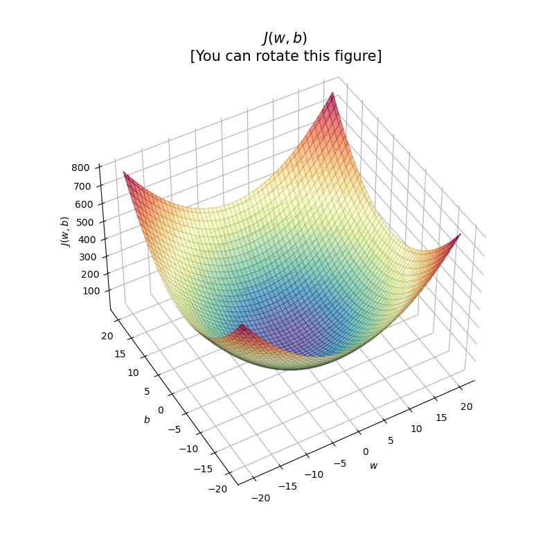
Figure 1: 3D visualization of the cost function \( J(w,b) = w^2 + b^2 \)
This 3D "bowl" shaped plot shows the cost surface of J(w, b). The lowest point represents the optimal values for w and b that minimize the cost. In a fully interactive environment (like Coursera Labs), this plot is rotatable.
📉 Image 2: Combined View – Line Fit, Contour Plot & Bowl:
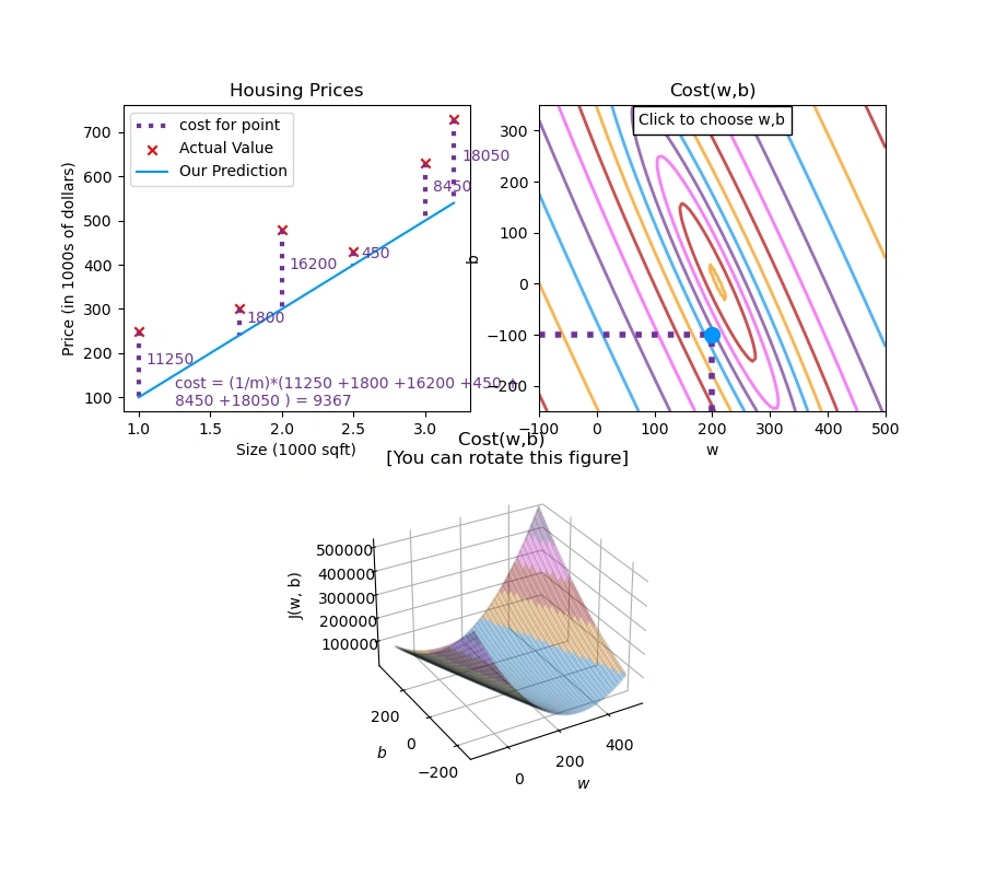
Figure 2: Interactive visualization of linear regression — Top-left:
Housing Prices fitted line; Right: Contour plot of Cost \( J(w, b) \);
Bottom: 3D Bowl plot. (Note: Interactivity such as rotation and click updates is not available in this static view.)
This figure combines three visuals:
Note: In a full interactive environment (e.g., Coursera Labs or Jupyter Notebook with widget backend), the 3D bowl is rotatable and the contour plot is clickable. However, these features are inactive in this static rendering due to local environment limitations.
📐 Cost Function Formula:
The cost function used in this visualization is the Mean Square Error (MSE) defined as:
\[ J(w, b) = \frac{1}{2m} \sum_{i=1}^{m} (w \cdot x_i + b - y_i)^2 \]
This equation calculates the average squared error between predicted and actual housing prices.
        x_train = np.array([1.0, 1.7, 2.0, 2.5, 3.0, 3.2])
        y_train = np.array([250, 300, 480,  430,   630, 730,])

        plt.close('all')
        fig, ax, dyn_items = plt_stationary(x_train, y_train)
        updater = plt_update_onclick(fig, ax, x_train, y_train, dyn_items)

        soup_bowl()
As the proprietary tools and functions from DeepLearning.ai were unavailable outside their lab environment, I redefined and recreated necessary utilities like cost computation, plotting functions, and interactive updates using Matplotlib and Numpy.
This project demonstrates not only technical skills in machine learning and data visualization but also the ability to adapt and innovate when tools and resources are limited. It reflects the resilience and creativity needed to succeed in the ever-evolving field of AI and machine learning.
I sincerely thank Prof. Andrew NG (DeepLearning.AI, Stanford University) for his inspiring courses that laid the foundation for this project.