-->

K-Means Clustering, PCA and Image Compression | Machine Learning & AI


K-Means Clustering, PCA and Image Compression

AI Generated image: K-Means Clustering, PCA and Image Compression


Introduction


Understanding K-Means Algorithm & Principal Component Analysis (PCA)

K-Means Algorithm & Principal Component Analysis (PCA)

Image 1: K-Means Algorithm & Principal Component Analysis (PCA)

K-Means Clustering in Python: A Step-by-Step Guide

Understanding K-Means Algorithm & Principal Component Analysis (PCA)

Choosing the Right Number of Clusters (K)

K-Means Clustering

Introduction

In this project, we explore two fundamental machine learning techniques: K-Means Clustering and Principal Component Analysis (PCA). These techniques are widely used in data compression, pattern recognition, and computer vision. Through practical examples, we demonstrate how clustering helps reduce complexity in images and how dimensionality reduction preserves essential features while simplifying data representation.

Understanding the Concepts

1️⃣ K-Means Clustering

K-Means Clustering is an unsupervised learning algorithm used to group similar data points into K clusters. K-means clustering is the Process in clustering similar data points in a 2D space into groups and widely used in grouping like:

  • βœ… Customers with similar purchasing habits,
  • βœ… Geographic locations of different cities,
  • βœ… Sensor data from different environmental conditions, etc.
In the context of image processing, we apply K-Means to perform color quantization, reducing the number of colors in an image while maintaining visual integrity.

The goal of K-Means is to minimize the total within-cluster variance, also known as the cost function (J):

\[ J = \sum_{i=1}^{m} \sum_{k=1}^{K} w_{ik} || x_i - C_k ||^2 \]

where:

  • \( m \) = number of data points
  • \( K \) = number of clusters
  • \( x_i \) = data point \( i \)
  • \( C_k \) = centroid of cluster \( k \)
  • \( w_{ik} \) = 1 if \( x_i \) belongs to cluster \( k \), otherwise 0

Centroid is the center of a cluster. It is an imaginary point that represents the average position of all points in that cluster.

The centroid of a cluster \( k \) is calculated as the mean of all points \( x_i \) in that cluster:

\[ C_k = \frac{1}{N_k} \sum_{i=1}^{N_k} x_i \]

where:

  • \( C_k \) = centroid of cluster \( k \)
  • \( N_k \) = number of points in cluster \( k \)
  • \( x_i \) = data points in cluster \( k \)

2️⃣ Principal Component Analysis (PCA)

Principal Component Analysis (PCA) is a powerful dimensionality reduction technique that finds the most important features in high-dimensional data. PCA is particularly useful in face recognition, where we extract key facial features to represent images efficiently.

How We Proceed

βœ… Clustering datasets (K-Means for clustered data)

βœ… Bird Image (K-Means for Image Compression)

  • The original bird image contains millions of colors in RGB format.
  • We apply K-Means clustering to reduce the image to only K colors.
  • This technique helps in image compression while preserving quality.

βœ… Face Image (PCA for Dimensionality Reduction)

  • A grayscale face image consists of thousands of pixels, making it high-dimensional.
  • We use PCA to extract the most important features (principal components).
  • This reduces storage size and improves efficiency in face recognition.

Project Goals

  • πŸ“Œ Demonstrate K-Means Clustering using a bird image for color quantization.
  • πŸ“Œ Apply PCA on face images to reduce dimensions while preserving essential features.
  • πŸ“Œ Visualize results using side-by-side comparisons of the original and processed images.

Through these examples, we highlight the power of unsupervised learning techniques in image processing and data compression. Let’s dive in! πŸš€


Lab Practical Exercises

Exercise 1: Clustering datapoints:

1.1 Importing Required Libraries:

        
        Python:

            %matplotlib inline
            import numpy as np
            import matplotlib.pyplot as plt
            import scipy.io  # Used to load the OCTAVE *.mat files
            from random import sample  # Used for random initialization
            import scipy.misc  # Used to show matrix as an image
            import matplotlib.cm as cm  # Used to display images in a specific colormap
            from scipy import linalg  # Used for the "SVD" function


Exppanation:

  • The %matplotlib inline command ensures that plots appear directly in Jupyter Notebook.
  • numpy is used for numerical operations, especially handling matrices and arrays.
  • matplotlib.pyplot is used for visualization.
  • scipy.io is used to read .mat files (MATLAB format).
  • random.sample helps in randomly selecting data points for initialization.
  • scipy.misc and matplotlib.cm are used for image processing and visualization.
  • scipy.linalg provides linear algebra functions, including Singular Value Decomposition (SVD), which is useful for Principal Component Analysis (PCA).

1.2 Loading Data from a .mat File

    
    Python:

        datafile = r'd:\mlprojects\data\ex7data2.mat' 
        mat = scipy.io.loadmat(datafile)
        X = mat['X']     # X shaped (300,2)
    

Here:

  • The dataset ex7data2.mat is loaded using scipy.io.loadmat().
  • X = mat['X'] extracts the feature matrix X from the .mat file.
  • X.shape = (300,2) means that we have 300 data points, each with two coordinates (x1, x2).
  • This dataset will be used for K-means clustering, where we will cluster these points into groups.

1.3 Defining initial centroid:

    
    Python:

        K = 3    # Set Number of centroids... K = 3
        initial_centroids = np.array([[3,3],[6,2],[8,5]])
    

Here:

  • We define K = 3, meaning we want to form three clusters.
  • The initial centroids are chosen manually as [[3,3], [6,2], [8,5]].
  • These centroids represent the starting points of the three clusters.
  • As the K-means algorithm runs, these centroids will be updated iteratively to better fit the data.

1.4 Visualizing Initial Data and Centroids

Python codes:


        # Function to visualize data points and centroids
        def plotData(myX, mycentroids, myidxs=None):

            """
            Function to plot the data and color it accordingly.
            myidxs should be the latest iteration index vector
            mycentroids should be a vector of centroids, one per iteration
            """

            colors = ['b', 'g', 'gold', 'darkorange', 'salmon', 'olivedrab']

            assert myX[0].shape == mycentroids[0][0].shape
            assert mycentroids[-1].shape[0] <= len(colors)

            # If idxs is supplied, divide up X into colors
            if myidxs is not None:
                assert myidxs.shape[0] == myX.shape[0]
                subX = []
                for x in range(mycentroids[0].shape[0]):
                    subX.append(np.array([myX[i] for i in range(myX.shape[0]) if myidxs[i] == x]))
            else:
                subX = [myX]
            
            fig = plt.figure(figsize=(7,5))
            for x in range(len(subX)):
                newX = subX[x]
                plt.plot(newX[:,0], newX[:,1], 'o', color=colors[x],
                        alpha=0.75, label='Data Points: Cluster %d' % x)

            plt.xlabel('x1', fontsize=14)
            plt.ylabel('x2', fontsize=14)
            plt.title('Plot of X Points', fontsize=16)
            plt.grid(True)

            # Drawing a history of centroid movement
            tempx, tempy = [], []
            for mycentroid in mycentroids:
                tempx.append(mycentroid[:,0])
                tempy.append(mycentroid[:,1])

            for x in range(len(tempx[0])):
                plt.plot(tempx, tempy, 'rx--', markersize=8)

            plt.legend()
            plt.show()


Code Explanation


  • The function def plotData(myX, mycentroids, myidxs=None) visualizes the data points and centroids.
  • The colors list ensures that each cluster has a different color.
  • Ifmyidxs (cluster assignments) is provided, it groups data points by cluster.
  • It plots the movement of centroids over iterations using red "X" markers ('rx--').
  • Finally, it displays the scatter plot of data points with centroids.

1.5 Plotting data


        Python:

            #Plot the initial data and centroid:
            plotData(X, [initial_centroids]) 


Output:

k-means clustering

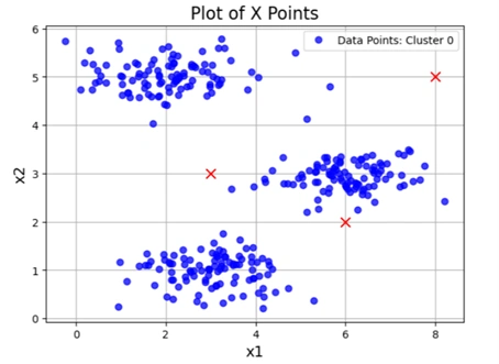
Image 2: Initial data visualization


  1. This is the original dataset before clustering begins.
  2. Blue points (tiny circles) represent data points.
  3. Red "X" markers indicate the initial centroids.
  4. In the next steps, the K-means algorithm will update the centroids iteratively to optimize clustering.

1.6 Function to Compute Squared Distance

        
        Python:

            def distSquared(point1, point2):
                assert point1.shape == point2.shape
                return np.sum(np.square(point2 - point1))


Explanation

  • This function def distSquared(point1, point2) computes the squared Euclidean distance between two points.
  • It first checks that the two points have the same shape.
  • It calculates the squared difference for each dimension and sums them up.
  • The squared distance is used instead of the actual Euclidean distance to avoid unnecessary square root calculations, which speeds up the process.

1.7 Finding Closest Centroids

Python codes:


        Python:

            def findClosestCentroids(myX, mycentroids):
                idxs = np.zeros((myX.shape[0], 1))

                for x in range(idxs.shape[0]):
                    mypoint = myX[x]
                    mindist, idx = 9999999, 0  # Initialize with a large number
                
                    for i in range(mycentroids.shape[0]):
                        mycentroid = mycentroids[i]
                        distsquared = distSquared(mycentroid, mypoint)
                    
                        if distsquared < mindist:
                            mindist = distsquared
                            idx = i
                
                    idxs[x] = idx  # Assign closest centroid index

                return idxs


Code Explanation

  • The function def findClosestCentroids(myX, mycentroids) assigns each data point in X to the nearest centroid.
  • It initializes an array idxs to store the index of the closest centroid for each data point.
  • For each point in X:
    1. It compares the squared distance to each centroid.
    2. The centroid with the smallest distance is assigned as the closest centroid.
  • The function returns a (m,1) vector where each element represents the assigned cluster for a point in X.

1.8 Assigning Data Points to Clusters

        
        Python:

            idxs = findClosestCentroids(X, initial_centroids)
            print(idxs[:3].flatten())  # Print the first 3 cluster assignments

            Output:
            [0. 2. 1.]


Explanation:

  • The function findClosestCentroids is called with X (data points) and initial_centroids (three predefined centroids).
  • It returns a list where each data point is assigned a cluster (0, 1, or 2).
  • The first three data points are assigned to clusters 0, 2, and 1, respectively.
  • This means:
    1. The first data point is closest to centroid 0 (first centroid in initial_centroids).
    2. The second data point is closest to centroid 2.
    3. The third data point is closest to centroid 1.

1.9 Visualizing Clustered Data

        
        Python:

            plotData(X, [initial_centroids], idxs)

            Output:
            Clustered data graph


kmeans_clustering

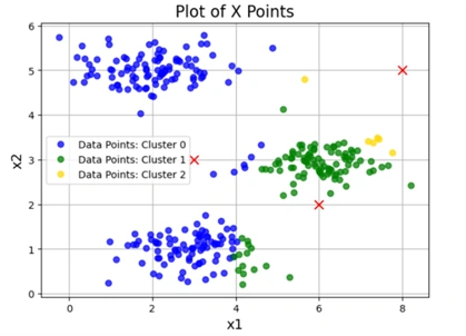
Image 3: Clustered graph


Explanation of output graph:

  • his image is a modified version of the original dataset after clustering with assigned colors.
  • Centroids are marked with red crosses (rx--).
  • Data points are plotted in three different colors (e.g., blue, green, yellow), corresponding to the three clusters.
  • Colors (Blue, Green, Yellow) Represent Clusters:
    1. The algorithm assigns each data point to the nearest centroid.
    2. Different colors indicate different clusters.
    3. The red x markers show the initial centroid positions.
  • Significance of Colors:
    1. Blue points belong to cluster 0.
    2. Green points belong to cluster 1.
    3. Yellow points belong to cluster 2.
  • This visualization is an important first step in K-means clustering, as it shows the initial assignments before iterating to refine centroids.

1.10 Computing New Centroid Positions


    Python:

        def computeCentroids(myX, myidxs):
            """
            Function takes in the X matrix and the index vector
            and computes a new centroid matrix.
            """
            subX = []
            for x in range(len(np.unique(myidxs))):
                subX.append(np.array([myX[i] for i in range(myX.shape[0]) if myidxs[i] == x]))

            return np.array([np.mean(thisX,axis=0) for thisX in subX])


Function Breakdown:


  • The function def computeCentroids(myX, myidxs) computes the new centroid positions after assigning data points to clusters.
  • Inputs:
    1. myX: The dataset (each row is a data point).
    2. myidxs: The cluster assignments for each point (from findClosestCentroids).
  • Steps:
    1. The function first groups data points by their assigned cluster.
    2. For each cluster, it calculates the mean of all assigned points.
    3. The new centroids are returned as an array.

Why is this Needed?


  • After assigning points to clusters, we must update the centroids based on the average position of points in each cluster.
  • These updated centroids are used in the next iteration of K-means.

1.11 Finding Closest Centroids


Python codes:


        Python:

            def runKMeans(myX, initial_centroids, K, n_iter):
                """
                Function that actually does the iterations
                """
                centroid_history = []
                current_centroids = initial_centroids

                for myiter in range(n_iter):
                    centroid_history.append(current_centroids)
                    idxs = findClosestCentroids(myX, current_centroids)
                    current_centroids = computeCentroids(myX, idxs)
                
                return idxs, centroid_history


Function Breakdown:


  • The function def runKMeans(myX, initial_centroids, K, n_iter) implements the iterative K-means clustering process.
  • Inputs:
    1. myX: The dataset.
    2. initial_centroids: Initial centroid positions.
    3. K: Number of clusters.
    4. n_iter: Number of iterations for K-means.
  • Steps:
    1. It stores the centroid positions after each iteration in centroid_history.
    2. For each iteration:
      • Assigns points to the nearest centroid (findClosestCentroids).
      • Computes new centroid positions (computeCentroids).
  • Returns the final cluster assignments and the history of centroid positions.

Why is this Needed?


  • K-means is an iterative algorithm, meaning it refines centroids over multiple steps until convergence.
  • The centroid_history allows visualization of centroid movement.

1.12 Running K-Means on the Dataset


        Python:

            idxs, centroid_history = runKMeans(X, initial_centroids, K=3, n_iter=10)


Runs the runKMeans function with:


  • X: The dataset.
  • initial_centroids: The starting centroids.
  • K=3: Three clusters.
  • n_iter=10: The algorithm iterates ten times.

What Happens Here?

  • The algorithm iterates through 10 steps of assigning points and updating centroids.
  • The final cluster assignments are stored in idxs.
  • The movement history of centroids is stored in centroid_history.

1.13 Plotting the K-Means Clustering Process


            Python:

            plotData(X, centroid_history, idxs)

            Output:
            Clustered image


kmeans_clustering

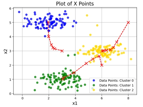
Image 4: K-means Clustering process over multiple iterations


This is a visualization of the K-means clustering process over multiple iterations.

The plot shows:


  • Clustered Data Points: Each point is colored based on its final cluster assignment.
  • Centroid Movements: Red β€˜X’ markers indicate centroid positions at different iterations.
  • Red Dashed Lines: Show the movement of centroids from one iteration to the next.
  • Each color represents a cluster:
    1. Blue points belong to Cluster 0.
    2. Green points belong to Cluster 1.
    3. Yellow points belong to Cluster 2.
  • Initially, centroids are placed randomly (or pre-selected).
  • Over 10 iterations, centroids shift closer to the mean of their assigned data points.

1.14 How Initial Centroids Affect K-Means Clustering Visualizations?


1.14.1 Choosing Random Initial Centroids


        Python:

            def chooseKRandomCentroids(myX, K):
                rand_indices = sample(range(0,myX.shape[0]),K)
                return np.array([myX[i] for i in rand_indices])    


Explanation


  • The function def chooseKRandomCentroids(myX, K) selects K random points from the dataset X to use as initial centroids for K-Means clustering.
  • sample(range(0,myX.shape[0]),K) randomly selects K unique indices from the dataset.
  • The function then returns the corresponding K points from X as initial centroids.

πŸ›  Why is this needed?


  • K-Means clustering is sensitive to initialization. Different initial centroids can lead to different clustering results.
  • This function helps ensure that the centroids are randomly selected, reducing bias in clustering.

1.14.2 Running K-Means with Different Initial Centroids


        Python:

        
            for x in range(3):      #Let's choose random initial centroids
                idxs, centroid_history = runKMeans(X,chooseKRandomCentroids(X,K=3),
                                                K=3,n_iter=10)
                plotData(X,centroid_history,idxs)

            Output:
                3 different clustering graphs


kmeans_clustering

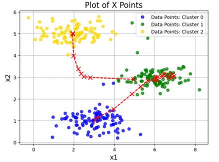
Image 5: K-means Clustering graph 1 with different initial Centroids


kmeans_clustering

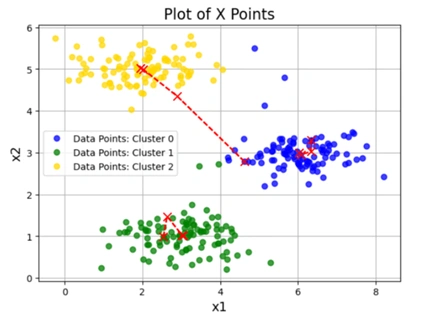
Image 6: K-means Clustering graph 2 with different initial Centroids


kmeans_clustering

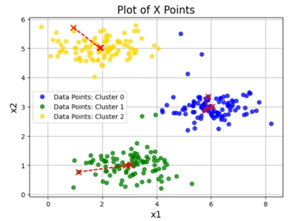
Image 7: K-means Clustering graph 3 with different initial Centroids


Explanation


Loop runs 3 times:


  1. In each iteration, the code chooses new random centroids using chooseKRandomCentroids(X, K=3).
  2. Runs K-Means clustering for 10 iterations using runKMeans(X, initial_centroids, K=3, n_iter=10).
  3. The function plotData(X, centroid_history, idxs) generates a visualization of the clustering process.
  4. Each image plots the data points (X values) and tracks the movement of centroids over 10 iterations.
  5. Red β€˜X’ marks indicate centroid positions at different iterations.
  6. Red dashed lines show how centroids move from their initial positions to final positions.
  7. Different positions of X and dashed lines indicate different initializations and convergence paths.

What knowledge we have gained here?


1️⃣ Effect of Random Initialization:


  • Different starting centroids lead to different clustering results.
  • Some initializations might converge to better clusters, while others might not.

2️⃣ Centroid Movement Over Iterations:


  • The red dashed lines show how centroids update at each iteration.
  • Shorter dashed lines mean the centroid moved less, suggesting faster convergence.

3️⃣ Final Cluster Assignments:


  • Even with different initializations, K-Means often converges to similar solutions if the dataset is well-structured.
  • If clusters are significantly different across images, it suggests K-Means is sensitive to initialization and might need multiple runs to find the best result.


How to Identify the Best Visualization?


Among the three graphs, the best visualization is the one that:

βœ… Has well-separated clusters – Each cluster is distinct, with minimal overlap.
βœ… Has centroids placed meaningfully – Centroids should be near the center of their assigned data points.
βœ… Shows stable convergence – The red dashed lines (which represent centroid movements) should decrease in length over iterations, indicating that centroids are settling into optimal positions.

2. Image Compression with K-Means


2.1 Understanding the Alpha Channel and Why We Remove It Before Image Compression


What is an Alpha Channel?


An alpha channel is an additional layer in an image that controls transparency. It is mainly used in RGBA images, where:


  • R (Red)
  • G (Green)
  • B (Blue)
  • A (Alpha) β†’ Controls transparency

A fully opaque pixel has an alpha value of 255, while a fully transparent pixel has an alpha value of 0.


Alpha Colorg

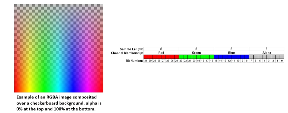
Image 8: K-means Clustering graph 3 with different initial Centroids


Why Remove the Alpha Channel Before Image Compression?


When performing K-Means clustering for image compression, removing the alpha channel is necessary due to the following reasons:


1️⃣ K-Means Clustering Works on RGB Colors


- The clustering algorithm groups colors (R, G, B), not transparency levels.

- If the alpha channel is included, K-Means would treat transparent and opaque pixels as different colors, leading to inaccurate clustering.


2️⃣ Prevents Errors in Image Processing


- Many image processing functions expect a 3-channel (RGB) image and do not support 4-channel (RGBA) images.

- Including the alpha channel may cause errors or unexpected results.


3️⃣ Ensures Consistent Image Representation


- Removing the alpha channel ensures that all pixels have the same structure (R, G, B values only).

- This simplifies reshaping and processing the image for compression.


How Do We Remove the Alpha Channel?


In our code, we check if the image has an alpha channel and remove it:


                    # Check if the image has an alpha channel (RGBA format)
                    if A.shape[2] == 4:  
                        A = A[:, :, :3]  # Keep only the first three channels (RGB)
                 

βœ… This keeps only the first 3 channels (R, G, B) and discards transparency.


When is the Alpha Channel Needed?


While removing the alpha channel is essential for K-Means clustering, it is useful in other cases like:


  • Transparent logos or overlays
  • Web design with semi-transparent elements
  • Layered images in graphic design software

For image compression, removing the alpha channel helps produce a clean and accurate color clustering.


2.1 K-means on pixels:


This part of the project applies K-Means clustering to an image to perform image compression by reducing the number of unique colors in the image.


Python codes:


        import imageio.v2 as imageio
        import matplotlib.pyplot as plt
        import numpy as np

        # Load image
        datafile = r'd:\mlprojects\data\bird_small2.png'
        A = imageio.imread(datafile)

        # Check if image has 4 channels (RGBA), convert to RGB
        if A.shape[2] == 4:  # Check if there's an alpha channel
            A = A[:, :, :3]  # Keep only the first three channels (RGB)

            # Display shape and image
            print("A shape after removing alpha channel:", A.shape)
            plt.imshow(A)
            plt.axis("off")  # Hide axes
            plt.show()

            A = A / 255.0     # Normalize pixel values (0 to 1)
            A = A.reshape(-1, 3) # Reshape image to (num_pixels, 3)
            print("New A shape:", A.shape)

            # Run k-means clustering
            myK = 16
            idxs, centroid_history = runKMeans(A, chooseKRandomCentroids(A, myK), myK, n_iter=10)       


Comments:


In the codes by myK = 16, we explicitly set 16 centroids enabling to store 16 colors in the future.

Output:

kmeans_clustering

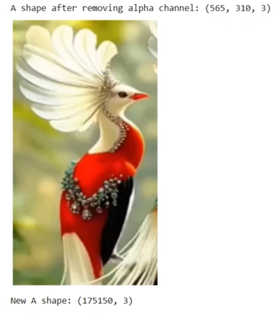
Image 9: Bird image for compression after removing alpha channel


The output indicates that now the image is of (565, 310, 3), which means image is:


  • 565 pixels in height
  • 310 ixels in width
  • 3 channels (RGB)
  • 4th channel Alpha is removed

At the bottom of output image "New A shape: (175150, 3)" indicates that:


  • Image is reshaped to β†’ (565 x 310, 3) = (175150, 3)
  • 175150 β†’ total number of pixels in the image
  • 3 β†’ Each pixel has 3 values (RGB = Red, Green, Blue)

Assigning Each Pixel to the Closest Centroid


        Python:

        idxs = findClosestCentroids(A, centroid_history[-1])


What this does:


  • The findClosestCentroids function assigns each pixel to its nearest centroid (one of the 16 colors).
  • centroid_history[-1] contains the final centroid positions after 10 iterations of K-Means.
  • idxs stores the index of the closest centroid for each pixel in the reshaped image.

βœ… At this point, each pixel is mapped to one of the 16 colors from K-Means clustering.

Reconstructing the Image with 16 Colors

        
            final_centroids = centroid_history[-1]

            final_image = np.zeros((idxs.shape[0], 3))  # Create new image with only 16 colors

            for x in range(final_image.shape[0]):
                final_image[x] = final_centroids[int(idxs[x].item())]  # βœ… Use .item() to extract scalar


What this does:


  • final_centroids = centroid_history[-1] β†’ Stores the final 16 centroid colors.
  • final_image = np.zeros((idxs.shape[0], 3)) β†’ Creates an empty array for the compressed image.
  • The loop assigns each pixel in the final_image to the corresponding centroid color.

βœ… At this point, the image is reconstructed using only 16 unique colors instead of the original full-color spectrum.


Displaying the Images


        orig_height, orig_width = 565, 310  # Use the correct values  # Get the original image dimensions
        plt.figure()  # Reshape the original and compressed images correctly
        dummy = plt.imshow(A.reshape(orig_height, orig_width, 3))  # βœ… Correct shape
        plt.figure()
        dummy = plt.imshow(final_image.reshape(orig_height, orig_width, 3))  # βœ… Correct shape
        plt.show()
    

What this does:


  • First plt.figure() and plt.imshow(A.reshape(orig_height, orig_width, 3))
    β†’ Displays the original image before compression.
  • Second plt.figure() and plt.imshow(final_image.reshape(orig_height, orig_width, 3))
    β†’ Displays the compressed image with 16 colors.
  • plt.show() β†’ Renders both images.

βœ… At this point, two images are displayed as output:


  • Original image
  • Compressed image using only 16 colors


Observation After Image Compressions


kmeans_clustering

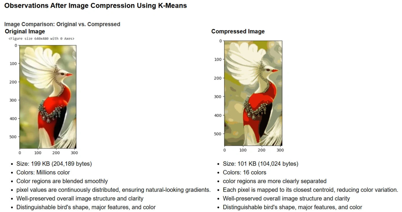
Image 10: Bird image for compression after removing alpha channel


Observations


While compression significantly reduces the number of unique colors in the image, it does not degrade the overall quality. Instead, it enhances the separation of different regions, making boundaries between colors more visible.


Principal Component Analysis (PCA) - Overview


Principal Component Analysis (PCA) is a dimensionality reduction technique used in machine learning and data analysis. It helps reduce the number of features while preserving as much variance in the data as possible. PCA works by transforming the original correlated features into a new set of uncorrelated features called Principal Components (PCs), ranked by their importance.


Uses and Applications of PCA


  • Data Compression: Reduces the dimensionality of large datasets while keeping the most important information.
  • Feature Selection: Identifies the most significant features for machine learning models.
  • Noise Reduction: Helps eliminate redundant or insignificant features.
  • Visualization: Allows high-dimensional data to be visualized in 2D or 3D.
  • Pattern Recognition: Used in face recognition, image compression, and medical diagnosis.

Code Breakdowns:


Python codes:


            datafile = r'd:\mlprojects\data\ex7data1.mat'  # Load dataset
            mat = scipy.io.loadmat(datafile)  # Read .mat file
            X = mat['X']  # Extract feature matrix

            # Quick plot of the dataset
            plt.figure(figsize=(7,5))
            plot = plt.scatter(X[:,0], X[:,1], s=30, facecolors='none', edgecolors='b')
            plt.title("Example Dataset", fontsize=18)
            plt.grid(True)
            plt.show()


Output:


kmeans_clustering

Image 11: Scattered graph before applying PCA


This code generates a scatter plot of the dataset. The points in the graph represent the original data points before applying PCA.


  • It shows a 2D distribution of data points.
  • We can observe the data's spread and correlation.
  • The goal of PCA is to find the best directions (principal components) along which the data varies the most.


Feature Normalization


Python codes:


        def featureNormalize(myX): 
            # Compute the mean of each feature
            means = np.mean(myX, axis=0)
            
            # Subtract the mean from the dataset
            myX_norm = myX - means
            
            # Compute the standard deviation and normalize
            stds = np.std(myX_norm, axis=0)
            myX_norm = myX_norm / stds
            
            return means, stds, myX_norm


Purpose of Feature Normalization


  • PCA is affected by the scale of data, so we normalize it to have a mean of 0 and a standard deviation of 1.
  • This ensures that each feature contributes equally to PCA.

Computing Principal Components Using SVD


        Python:

            def getUSV(myX_norm):
                cov_matrix = myX_norm.T.dot(myX_norm) / myX_norm.shape[0] #Compute the covariance matrix
                
                # Perform Singular Value Decomposition (SVD)
                U, S, V = scipy.linalg.svd(cov_matrix, full_matrices=True, compute_uv=True)
                return U, S, V


πŸ”Ή What is happening here?


  • The covariance matrix is computed, which captures feature relationships.
  • Singular Value Decomposition (SVD) is applied to get:
    U: Principal component directions (eigenvectors).
    S: Strength (variance explained) of each component.
    V: Not directly used in PCA.

Running PCA


        Python:

            means, stds, X_norm = featureNormalize(X)  # Normalize features
            U, S, V = getUSV(X_norm)   # Run SVD to compute principal components


πŸ”Ή Purpose of This Step


  • The dataset X is normalized before applying PCA.
  • PCA finds the principal components by computing U and S.


Scatter Plot with Principal Components


Code Breakdown


Python codes:


            # Quick scatter plot of original data
            plt.figure(figsize=(7,5))
            plt.scatter(X[:,0], X[:,1], s=30, facecolors='none', edgecolors='b')

            # Add principal component lines
            plt.plot([means[0], means[0] + 1.5*S[0]*U[0,0]], 
                [means[1], means[1] + 1.5*S[0]*U[0,1]],
                color='red', linewidth=3, label='First Principal Component')

            plt.plot([means[0], means[0] + 1.5*S[1]*U[1,0]], 
                [means[1], means[1] + 1.5*S[1]*U[1,1]],
                color='fuchsia', linewidth=3, label='Second Principal Component')

            # Labels, grid, and legend
            plt.title("Example Dataset: PCA Eigenvectors Shown", fontsize=18)
            plt.xlabel('x1', fontsize=18)
            plt.ylabel('x2', fontsize=18)
            plt.grid(True)
            plt.legend(loc=4)  # Bottom-right legend

            plt.show()


Output graph

kmeans_clustering

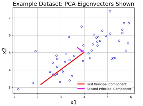
Image 12: Scattered graph after applying PCA


Output Explanation

This graph displays the original data points along with two principal component vectors.

πŸ”Ή Understanding the Principal Components


  1. First Principal Component (Red Line)
    • It represents the direction of maximum variance.
    • Most of the data variation occurs along this axis.
    • It is the most important feature after applying PCA.
  2. Second Principal Component (Magenta Line)
    • It is perpendicular to the first component.
    • It captures the remaining variance in the data.
    • It is less important than the first principal component.

βœ… Key Observations


  • The first principal component aligns with the largest spread in data.
  • The second principal component captures the next most significant variation.
  • These components can be used to reduce the data to 1D while keeping most of the variance.


Dimensionality Reduction with PCA


        Python:

            def projectData(myX, myU, K):
                Ureduced = myU[:, :K]
                z = myX.dot(Ureduced)
                return z


Explanation: Projects the dataset onto the top K principal components, reducing dimensionality.


Project First Example onto First Principal Component


    Python:

        z = projectData(X_norm, U, 1)
        print('Projection of the first example is %0.3f.' % z[0].item())
    
    
    Output: 
        Projection of the first example is 1.496.
    

Explanation: This value represents the new coordinate of the first data point after projection onto the first principal component.

Reconstruct Data from Reduced Dimensions

        
        Python:

            def recoverData(myZ, myU, K):
                Ureduced = myU[:, :K]
                Xapprox = myZ.dot(Ureduced.T)
                return Xapprox


Explanation: Reconstructs an approximation of the original dataset from the projected data.

Recover First Example

        
        Python:

            X_rec = recoverData(z, U, 1)
            print('Recovered approximation of the first example is ', X_rec[0])


            Outpot:

            Recovered approximation of the first example is [-1.05805279 -1.05805279]


Explanation:


  • The recovered point is an approximation of the original data in the reduced space.
  • Why are both values the same? Because the first principal component aligns along the diagonal, making both coordinates equal after projection.


Visualizing PCA Projection


Python codes:


            plt.figure(figsize=(7,5))
            plt.scatter(X_norm[:,0], X_norm[:,1], s=30, facecolors='none', edgecolors='b', label='Original Data Points')
            plt.scatter(X_rec[:,0], X_rec[:,1], s=30, facecolors='none', edgecolors='r', label='PCA Reduced Data Points')

            for x in range(X_norm.shape[0]):
                plt.plot([X_norm[x,0], X_rec[x,0]], [X_norm[x,1], X_rec[x,1]], 'k--')

                plt.title("Example Dataset: Reduced Dimension Points Shown", fontsize=14)
                plt.xlabel('x1 [Feature Normalized]', fontsize=14)
                plt.ylabel('x2 [Feature Normalized]', fontsize=14)
                plt.grid(True)
                plt.legend(loc=4)
                plt.xlim((-2.5,2.5))
                plt.ylim((-2.5,2.5))
                plt.show()
        
    
kmeans_clustering

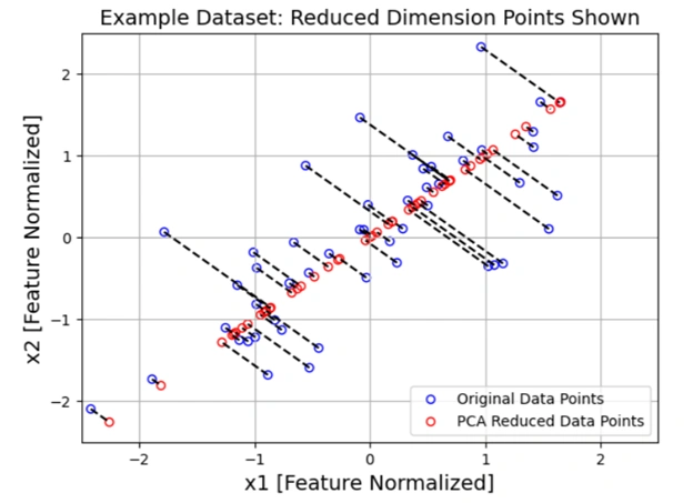
Image 13: Graph showing projected data onto a one-dimensional space

Output: A graph showing:


  1. Small red circles (PCA reduced data points) on a diagonal line
    • This indicates that after PCA, the data is projected onto a one-dimensional space, capturing the most important variance.
  2. Dashed lines connecting original points (blue) to projected points (red)
    • These lines show the data reconstruction error how much information is lost during dimensionality reduction).
  3. Diagonal Line: Represents the 1D projection of the dataset.
  4. Dashed Lines: Show the difference between original data and approximated data (reconstruction error).
  5. Overall Significance: PCA reduced the dataset from 2D to 1D while preserving the most variance, effectively summarizing the data.

Face Image Dataset

Importing Necessary Libraries

        
        Python:

            import numpy as np
            import matplotlib.pyplot as plt
            from matplotlib import cm
            from PIL import Image
            import scipy.io


βœ… Loaded the required libraries for numerical computation, visualization, and image processing.


Loading the Face Image Dataset


        Python:

            datafile = r'd:\mlprojects\data\ex7faces.mat'
            mat = scipy.io.loadmat(datafile)
            X = mat['X']


βœ… This code loads the face dataset from a .mat file. The dataset X contains grayscale ima ges of faces, where each row represents a 32Γ—32 pixel image as a flattened vector of 1024 values.


Displaying Face Images


        Python:

        def getDatumImg(row):
            """ Convert a row vector into a 32x32 image """
            width, height = 32, 32
            square = row.reshape(width, height)
            return square.T


βœ… This function reshapes one row (flattened 1024 pixels) back into a 32Γ—32 grayscale image.

Python codes:


            def displayData(myX, mynrows=10, myncols=10):
                """ Display 100 face images in a 10x10 grid """
                width, height = 32, 32
                nrows, ncols = mynrows, myncols

                big_picture = np.zeros((height * nrows, width * ncols))

                irow, icol = 0, 0
                for idx in range(nrows * ncols):
                    if icol == ncols:
                        irow += 1
                        icol = 0
                    iimg = getDatumImg(myX[idx])
                    big_picture[
                        irow * height : irow * height + iimg.shape[0],
                        icol * width : icol * width + iimg.shape[1]
                    ] = iimg
                    icol += 1

                # Normalize to 0-255 for better contrast
                big_picture = (big_picture - np.min(big_picture)) / (np.max(big_picture) - np.min(big_picture)) * 255
                big_picture = big_picture.astype(np.uint8)

                # Display the image
                fig, ax = plt.subplots(figsize=(10, 10))
                img = Image.fromarray(big_picture)
                ax.imshow(img, cmap=cm.Greys_r)

                # Set axis labels
                ax.set_xticks(np.linspace(0, width * ncols, num=5))
                ax.set_xticklabels(np.linspace(0, width * ncols, num=5, dtype=int))

                ax.set_yticks(np.linspace(0, height * nrows, num=5))
                ax.set_yticklabels(np.linspace(height * nrows, 0, num=5, dtype=int))

                plt.show()


βœ… This function arranges 100 face images in a 10Γ—10 grid and displays them.

        
        Python:

        displayData(X)


        Output:

        Face images
        
    
kmeans_clustering

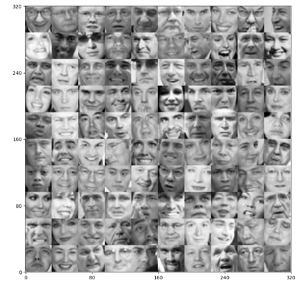
Image 14: 10 x 10 grid of faces


βœ… Output Explanation


  • A 10Γ—10 grid of faces appears.
  • X-axis labels (0-320) and Y-axis labels (320-0) indicate pixel positions in the big image.
  • Each face is reconstructed from 1024 pixels, reshaped into a 32Γ—32 grayscale image.

πŸ”Ή Significance of Output:


  • It visualizes raw face images before applying PCA for dimensionality reduction.
  • Later, PCA will be used to compress and reconstruct these images with fewer dimensions.
  • Loaded and visualized face images, are ready PCA compression.

Next Steps: Apply PCA to reduce face image dimensions and reconstruct them with minimal loss.


Performing PCA (Principal Component Analysis) on Face Images


        Python:

            # Feature normalize
            means, stds, X_norm = featureNormalize(X)
            # Run SVD
            U, S, V = getUSV(X_norm)


What’s Happening Here?


  • Feature normalization (featureNormalize(X)):
    1. Subtracts the mean and divides by standard deviation to standardize each feature.
  • Singular Value Decomposition (getUSV(X_norm)):
    1. Computes the principal components U, S, V of the normalized dataset.
    2. U contains the eigenvectors (principal components)β€”directions of maximum variance.
    3. S contains the eigenvaluesβ€”importance of each eigenvector.

Eigenvalues: An Intuitive Explanation


Eigenvalues are scalars that indicate how much a corresponding eigenvector is stretched or shrunk during a linear transformation.


Mathematical Definition


Eigenvalues and Eigenvectors


For a given square matrix \( A \), an eigenvalue \( \lambda \) and an eigenvector \( v \) satisfy the equation:

\[ A v = \lambda v \]

where:

  • \( A \) is an \( n \times n \) matrix.
  • \( v \) is an eigenvector (a nonzero vector).
  • \( \lambda \) is an eigenvalue (a scalar that tells us how the eigenvector is scaled).

Eigenvalues in PCA (Principal Component Analysis)


In Principal Component Analysis (PCA), eigenvalues tell us how much variance (information) is captured by each principal component:


  • Larger eigenvalues β†’ More variance captured β†’ More important component.
  • Smaller eigenvalues β†’ Less variance captured β†’ Less important component.

When performing dimensionality reduction, we keep only the top k eigenvalues and their corresponding eigenvectors to retain the most important features.


Visualizing the Top 36 Principal Components (Eigenfaces)


    Python:
        
            # Visualize the top 36 eigenvectors found # "Eigenfaces" lol
            displayData(U[:,:36].T, mynrows=6, myncols=6)

            Output:
            6 x 6 image with fade faces
        
    
kmeans_clustering

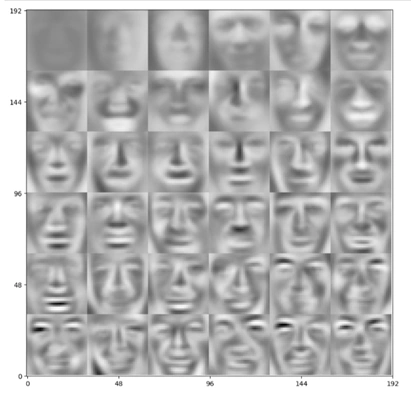
Image 15: 6 x 6 fade face like objects


Explanation of Output


  • The output is a 6x6 grid displaying the first 36 principal components (eigenfaces).
  • Each eigenface represents a feature extracted from the dataset.
  • The images are not as clear as those in ealier image because:
    1. These are not real faces but principal components that define face-like patterns.
    2. Some components capture general facial structures, while others capture details like edges, shadows, and nose shapes.
  • These eigenfaces will be used to reduce dimensionality and reconstruct images later.

What Are Eigenfaces?


Eigenfaces are a set of eigenvectors used in Principal Component Analysis (PCA) for facial recognition. They represent the most important features (principal components) of a dataset containing face images.


Concept Behind Eigenfaces


  1. Convert Faces to Vectors
    • Each face image (e.g., 32Γ—32 pixels) is reshaped into a vector.
    • A dataset of multiple faces forms a matrix where each row represents a face.

  2. Compute the Mean Face
    • The average face is computed and subtracted from all face vectors to normalize them.

  3. Apply PCA (Principal Component Analysis)
    • PCA finds the directions (eigenvectors) in which the face dataset varies the most.
    • These eigenvectors are called eigenfaces, as they represent important face features.

  4. Eigenfaces as Basis Vectors
    • Any face image can be approximated as a combination of these eigenfaces.
    • The eigenfaces with the largest eigenvalues capture the most variance (important details).
    • Fewer eigenfaces can be used to reconstruct a face with reduced dimensions.

Why Use Eigenfaces?


  • Dimensionality Reduction: Instead of storing raw images, we store weights (projections) of faces on eigenfaces.
  • Facial Recognition: New faces can be compared by measuring distances in the lower-dimensional space.
  • Noise Reduction: Unimportant variations (e.g., lighting, small distortions) are ignored.

Visualization of Eigenfaces


  • The the output shows a 6Γ—6 grid of 36 eigenfaces.
  • These represent the top 36 eigenvectors capturing the most important features.
  • The images appear blurry because they capture abstract features rather than clear faces.
  • In the reconstructed images using 36 eigenfaces are displayed in a 10Γ—10 grid.

Eigenfaces are an efficient way to store and recognize faces using PCA. By keeping only the most significant eigenfaces, we can compress face data while preserving its essential features.

Dimensionality Reduction (Projecting onto Top 36 Eigenfaces)

        
        Python:

            # Project each image down to 36 dimensions
            z = projectData(X_norm, U, K=36)


What’s Happening Here?


  • Each 1024-dimensional face image is now compressed into a 36-dimensional representation.
  • This means instead of storing all 1024 pixels, we keep only the top 36 eigenface weights.
  • This saves memory and computational cost while preserving most face features.

Reconstructing Images from 36 Principal Components

        
        Python:

            # Attempt to recover the original data
            X_rec = recoverData(z, U, K=36)


  • Since the images were projected onto 36 eigenfaces, this step reconstructs them back to the original 1024-pixel format.
  • The reconstructed images will be blurry compared to the originals because some details are lost during dimensionality reduction.

Displaying Reconstructed Images


        Python:

            # Plot the dimension-reduced data
            displayData(X_rec)

            Output:
            10 x 10 Image


kmeans_clustering

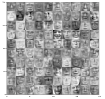
Image 16: 10 x 10 Reconstructed image fade face like objects


Explanation of Output


  • 10x10 grid displaying the reconstructed faces.
  • These images are clearer than previous image, but not as sharp as original because:
    1. Full 1024-pixel information per face.
    2. Reconstructs faces using only 36 principal components, losing fine details.

This demonstrates how Principal Component Analysis (PCA) reduces dimensionality while still retaining essential image features.

Feature Normalization and SVD

        
        Python:

            # Feature normalize
            means, stds, A_norm = featureNormalize(A)
            # Run SVD
            U, S, V = getUSV(A_norm)


  • The original image data A is reshaped into a matrix where each row is a pixel, and each column represents an RGB color channel.
  • featureNormalize(A) standardizes the pixel color values by subtracting the mean and dividing by the standard deviation.
  • Singular Value Decomposition (SVD) is performed using getUSV(A_norm), extracting:
    1. U: The principal component directions (eigenvectors)
    2. S: Singular values (importance of each component)
    3. V: Another matrix involved in decomposition but not used here.


Projecting 3D RGB Data to 2D Using PCA


        Python:

            # Use PCA to go from 3->2 dimensions
            z = projectData(A_norm, U, 2)


  • The projectData function reduces the RGB color space (3D) into 2 principal components.
  • The result z is a 2D dataset representing the most significant variations in the image colors./li>

Plotting the 2D PCA Projection

Python codes:


            # Make the 2D plot
            subX = []
            for x in range(len(np.unique(idxs))):
                subX.append(np.array([A[i] for i in range(A.shape[0]) if idxs[i] == x]))

                fig = plt.figure(figsize=(8,8))
                for x in range(len(subX)):
                newX = subX[x]
                plt.plot(newX[:,0],newX[:,1],'.',alpha=0.3)

                plt.xlabel('z1',fontsize=14)
                plt.ylabel('z2',fontsize=14)
                plt.title('PCA Projection Plot',fontsize=16)
                plt.grid(True)
                plt.show()
        
    
kmeans_clustering

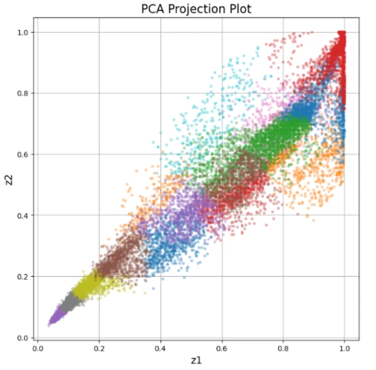
Image 17: Generated image

  • The color clusters from the image are grouped using idxs, which assigns each pixel to one of 16 clusters.
  • The loop separates pixels into different clusters (subX) for plotting.
  • A scatter plot is created using the first two principal components (z1, z2).
  • Each cluster is plotted as a group of points, showing how the color data is distributed in the reduced 2D PCA space.

Interpretation of the Output Image


1. The PCA Projection Plot is a scatter plot where:


  • Each point represents a pixel from the original image.
  • Clusters represent different dominant colors in the image.
  • The X-axis (z1) and Y-axis (z2) are the two most important principal components extracted from RGB data.

2. This visualization helps in understanding how colors are distributed in the image without needing a 3D RGB plot.


This is useful for image compression, color clustering, and feature extraction in computer vision tasks! πŸš€

Conclusion of PCA and Image Compression Project

Key Takeaways:

1. Dimensionality Reduction with PCA

- PCA was applied to image data, starting with feature normalization and computing Singular Value Decomposition (SVD) to extract principal components.
- This helped project high-dimensional image data into lower-dimensional spaces while retaining important features.


2. Eigenfaces and Face Representation

- By extracting eigenfaces from a dataset of human faces, we visualized the most significant facial features.
- Reducing image dimensions allowed us to compress and reconstruct faces while analyzing how much detail was preserved.


3. Image Compression & Reconstruction

- Images were projected onto a lower-dimensional subspace (e.g., 36 principal components) and reconstructed to evaluate the loss of detail.
- The reconstructed images retained main features, demonstrating PCA’s effectiveness in image compression.


4. Color Clustering & PCA Visualization

- PCA was used to reduce RGB color data from 3D to 2D for easier visualization of color clusters.
- The final PCA projection plot illustrated how PCA can assist in image segmentation and clustering.

Final Thoughts

This project successfully demonstrated PCA’s power in reducing data complexity while maintaining essential structure in images. From face recognition to color compression, PCA proves to be a valuable tool in machine learning and computer vision.

Future improvements could involve exploring non-linear dimensionality reduction techniques like t-SNE or Autoencoders for better visualization and reconstruction quality.

πŸš€ Thank you for following along!


Acknowledgments


I sincerely thank Prof. Andrew NG (DeepLearning.AI, Stanford University) for his inspiring courses that laid the foundation for this project.


Contact Me

hoque@HoqueAi.com

+1 473 607 1949

Download Resume