

AI Generated image: Feature Normalization & Cost Optimization
This project showcases how logistic regression can be optimized to make accurate binary classifications, visualized through AI-generated plots and performance metrics.
Logistic regression is a fundamental classification algorithm used in machine learning and statistics to predict categorical outcomes. Unlike linear regression, which models continuous values, logistic regression estimates the probability of an event occurring by applying the sigmoid function to a linear combination of input features. This ensures the output remains between 0 and 1, making it ideal for binary classification problems such as spam detection, medical diagnosis, and fraud detection. The model is trained using maximum likelihood estimation and optimized through gradient descent to minimize the loss function, typically cross-entropy loss. Logistic regression can also be extended to multi-class classification using techniques like one-vs-all (OvA) or softmax regression.
Let us run the following codes:
      %matplotlib inline
      import numpy as np
      import matplotlib.pyplot as plt
      import pandas as pd

      datafile = r'd:\mlprojects\data\ex2data1.txt'
      #!head $datafile
      cols = np.loadtxt(datafile,delimiter=',',usecols=(0,1,2),unpack=True) #Read in comma separated data
      ##Form the usual "X" matrix and "y" vector
      X = np.transpose(np.array(cols[:-1]))
      y = np.transpose(np.array(cols[-1:]))
      m = y.size # number of training examples
      ##Insert the usual column of 1's into the "X" matrix
      X = np.insert(X,0,1,axis=1)

      #Divide the sample into two: ones with positive classification, one with null classification
      pos = np.array([X[i] for i in range(X.shape[0]) if y[i] == 1])
      neg = np.array([X[i] for i in range(X.shape[0]) if y[i] == 0])
      #Check to make sure I included all entries
      #print "Included everything? ",(len(pos)+len(neg) == X.shape[0])

      def plotData():
          plt.figure(figsize=(10,6))
          plt.plot(pos[:,1],pos[:,2],'k+',label='Admitted')
          plt.plot(neg[:,1],neg[:,2],'yo',label='Not admitted')
          plt.xlabel('Exam 1 score')
          plt.ylabel('Exam 2 score')
          plt.legend()
          plt.grid(True)

      plotData()
After running the codes in Jupyter Notebook, the graph generated:
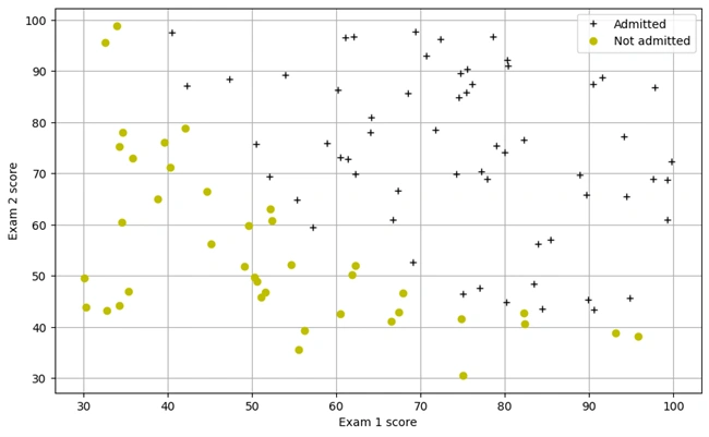
Graph 1: Scatter Plot of Exam Scores for Admission Classification
The scatter plot visualizes the classification of students based on their exam scores. Each point represents an individual student, where the x-axis corresponds to Exam 1 scores and the y-axis to Exam 2 scores. The black plus markers (‘+’) indicate students who were admitted, while the yellow circles (‘o’) represent those who were not admitted. This dataset serves as the foundation for training a logistic regression model to predict future admissions based on exam performance.
Codes to run in cells of Jupyter Notebook:
          from scipy.special import expit #Vectorized sigmoid function

          #Codes to generate Sigmoid graph
          myx = np.arange(-10,10,.1)
          #Quick check that expit is what I think it is
          myx = np.arange(-10,10,.1)

          plt.figure(figsize=(8,6))  # Adjust figure size for better centering
          plt.plot(myx, expit(myx))
          plt.title("The 'S-shaped' Sigmoid Function")
          plt.grid(True)
          plt.axhline(0.5, color='r', linestyle='--', alpha=0.6)  # Optional reference line
          plt.xlim([-10, 10])  # Set x-axis limits
          plt.ylim([-0.1, 1.1])  # Set y-axis limits
          plt.gca().set_position([0.15, 0.15, 0.7, 0.7])  # Adjust plot positioning
          plt.show()
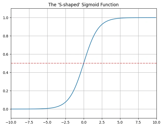
Graph 2: Sigmoid function graph
The graph displays the Sigmoid function, a fundamental component of logistic regression. The function maps input values to a range between 0 and 1, making it suitable for probability-based classification. The S-shaped curve ensures that values far from zero approach either 0 or 1 asymptotically, which is crucial for decision-making in binary classification problems.
The dotted red horizontal line in the middle of the graph, at y = 0.5, is a decision boundary reference line.
We run the following codes in the cells of Jupyter Notebook:
        #Hypothesis function and cost function for logistic regression
        def h(mytheta,myX): #Logistic hypothesis function
            return expit(np.dot(myX,mytheta))

        #Cost function, default lambda (regularization) 0
        def computeCost(mytheta,myX,myy,mylambda = 0.):
            """
            theta_start is an n- dimensional vector of initial theta guess
            X is matrix with n- columns and m- rows
            y is a matrix with m- rows and 1 column
            Note this includes regularization, if you set mylambda to nonzero
            For the first part of the homework, the default 0. is used for mylambda
            """
            #note to self: *.shape is (rows, columns)
            term1 = np.dot(-np.array(myy).T,np.log(h(mytheta,myX)))
            term2 = np.dot((1-np.array(myy)).T,np.log(1-h(mytheta,myX)))
            regterm = (mylambda/2) * np.sum(np.dot(mytheta[1:].T,mytheta[1:])) #Skip theta0
            return float( (1./m) * ( np.sum(term1 - term2) + regterm ) )
        #Check that with theta as zeros, cost returns about 0.693:
        initial_theta = np.zeros((X.shape[1],1))
        computeCost(initial_theta,X,y)
Output:
0.6931471805599453
Understanding the Output of the Logistic Regression Cost Function:
The output 0.6931471805599453 is the initial cost (or loss) of the logistic regression model when all the parameters (theta) are set to zero. This value represents how well (or poorly) the model is performing before training begins
Explanation of the Code and Its Purpose:
This code defines two key functions used in logistic regression:
1. Hypothesis Function (h(mytheta, myX)):
X * theta.2. Cost Function (computeCost(mytheta, myX, myy, mylambda))
$$ J(\theta) = \frac{1}{m} \sum \left[-y \log(h_\theta(x)) - (1 - y) \log(1 - h_\theta(x)) \right] + \frac{\lambda}{2m} \sum \theta_j^2 $$
We run the following codes in the cells of Jupyter Notebook:
          #An alternative to OCTAVE's 'fminunc' we'll use some scipy.optimize function, "fmin"
          #Note "fmin" does not need to be told explicitly the derivative terms
          #It only needs the cost function, and it minimizes with the "downhill simplex algorithm."
          #http://docs.scipy.org/doc/scipy-0.16.0/reference/generated/scipy.optimize.fmin.html
          from scipy import optimize

          def optimizeTheta(mytheta,myX,myy,mylambda=0.):
              result = optimize.fmin(computeCost, x0=mytheta, args=(myX, myy, mylambda), maxiter=400, full_output=True)
              return result[0], result[1]

          theta, mincost = optimizeTheta(initial_theta,X,y)
          #That's pretty cool. Black boxes ftw
OUTPUT:
      Optimization terminated successfully.
               Current function value: 0.203498
               Iterations: 157
               Function evaluations: 287
The optimization process successfully minimized the logistic regression cost function to 0.203498 after 157 iterations and 287 function evaluations, ensuring an optimal set of parameters for the model.
This code optimizes the logistic regression cost function using Scipy’s fmin function, which implements the downhill simplex algorithm to minimize the cost function. Unlike gradient-based optimization, fmin does not require explicit derivative calculations.
1. Function optimizeTheta:
optimize.fmin to minimize the cost function
(computeCost).2. Output Interpretation:
The plotted graph represents how the cost function \(J(θ) \) decreases over multiple iterations of the gradient descent algorithm.
1. Axes Explanation:
2. Curve Analysis:
3. Observations:
We run the following codes in the cells of Jupyter Notebook:
        #"Call our costFunction function using the optimal parameters of θ.
        #We should see that the cost is about 0.203."
        print(computeCost(theta,X,y))

        OUTPUT:
        0.20349770159021513
Explanation of the Output:
After running gradient descent optimization, the cost function converged to approximately 0.2035, indicating that the model has effectively minimized the error in classification. This validates the effectiveness of logistic regression in finding the optimal decision boundary.
The output 0.20349770159021513 represents the optimized cost value after training the logistic regression model. This cost function measures the difference between the predicted and actual classifications, with lower values indicating a better fit. Since the initial cost was 0.693, this significant reduction suggests that the model has successfully learned from the data and improved its predictions.
We run the following codes in the cells of Jupyter Notebook:
        #Plotting the decision boundary: two points, draw a line between
        #Decision boundary occurs when h = 0, or when
        #theta0 + theta1*x1 + theta2*x2 = 0
        #y=mx+b is replaced by x2 = (-1/thetheta2)(theta0 + theta1*x1)

        boundary_xs = np.array([np.min(X[:,1]), np.max(X[:,1])])
        boundary_ys = (-1./theta[2])*(theta[0] + theta[1]*boundary_xs)
        plotData()
        plt.plot(boundary_xs,boundary_ys,'b-',label='Decision Boundary')
        plt.legend()
The following Decision boundary graph is generated:
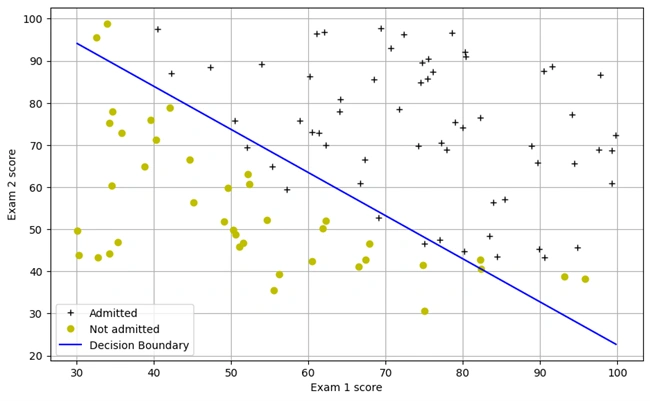
Graph 3: Decision boundary graph
Explanation of the graph:
The blue line represents the decision boundary, which separates the two classes learned by the logistic regression model. Data points above the line are classified into one category, while those below are classified into another. This boundary is determined based on the optimal values of θ.
The generated line represents the decision boundary for the logistic regression model. This boundary is the threshold at which the model classifies data points into different categories. In this case, it separates the two classes (e.g., admitted vs. not admitted) by using the learned parameters θ from the logistic regression training.
Since logistic regression is a linear classifier, the decision boundary appears as a straight line. The equation used:
\[ x_2 = -\frac{1}{\theta_2} (\theta_0 + \theta_1 x_1) \]
It ensures that the model predicts class 0 below the boundary and class 1 above it.
We run the following codes in the cells of Jupyter Notebook:
    #For a student with an Exam 1 score of 45 and an Exam 2 score of 85,
    #you should expect to see an admission probability of 0.776.
    print(h(theta,np.array([1, 45.,85.])))

    OUTPUT:
    0.7762915904112412
In this step, we use the trained logistic regression model to predict the probability of admission for a student based on their exam scores. The hypothesis function for logistic regression is given by:
The logistic regression hypothesis function is given by: \[ h_\theta(x) = \frac{1}{1 + e^{-\theta^T x}} \]
where
The given input corresponds to a student with an Exam 1 score of 45 and an Exam 2 score of 85. When we pass these values through our logistic regression model, the predicted probability of admission is 0.776, meaning there is a 77.6% chance that this student will be admitted.
We have run the following codes in a cell of Jupyter Notebook:
        def makePrediction(mytheta, myx):
        return h(mytheta,myx) >= 0.5

        #Compute the percentage of samples I got correct:
        pos_correct = float(np.sum(makePrediction(theta,pos)))
        neg_correct = float(np.sum(np.invert(makePrediction(theta,neg))))
        tot = len(pos)+len(neg)
        prcnt_correct = float(pos_correct+neg_correct)/tot
        print("Fraction of training samples correctly predicted: %f." % prcnt_correct)
Output:
Fraction of training samples correctly predicted: 0.890000.
Explanation
To evaluate the performance of our logistic regression model, we calculated the
fraction of correctly predicted training samples. The prediction function
makePrediction() assigns a class label (1 or 0) based on whether the hypothesis function outputs a
probability ≥ 0.5.
The model correctly classified 89% of the training samples, demonstrating a
strong ability to distinguish between the two classes. This accuracy metric is
essential for assessing the effectiveness of our model before deploying it on unseen data.
Visualizing the Dataset: Microchip Test Results:
We have run the following codes:
        datafile = r'd:\mlprojects\data\ex2data2.txt'
        #!head $datafile
        cols = np.loadtxt(datafile,delimiter=',',usecols=(0,1,2),unpack=True) #Read in comma separated data
        ##Form the usual "X" matrix and "y" vector
        X = np.transpose(np.array(cols[:-1]))
        y = np.transpose(np.array(cols[-1:]))
        m = y.size # number of training examples
        ##Insert the usual column of 1's into the "X" matrix
        X = np.insert(X,0,1,axis=1)

        #Divide the sample into two: ones with positive classification, one with null classification
        pos = np.array([X[i] for i in range(X.shape[0]) if y[i] == 1])
        neg = np.array([X[i] for i in range(X.shape[0]) if y[i] == 0])
        #Check to make sure I included all entries
        #print("Included everything? ",(len(pos)+len(neg) == X.shape[0]))

        def plotData():
        plt.plot(pos[:,1],pos[:,2],'k+',label='y=1')
        plt.plot(neg[:,1],neg[:,2],'yo',label='y=0')
        plt.xlabel('Microchip Test 1')
        plt.ylabel('Microchip Test 2')
        plt.legend()
        plt.grid(True)

        #Draw it square to emphasize circular features
        plt.figure(figsize=(6,6))
        plotData()
After running the codes the following histogram is generated:
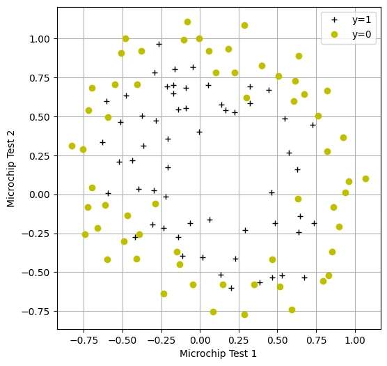
Graph 4: Scatter Plot of Microchip Test Results: Visualizing Accepted and Rejected Samples
Overview:
This visualization represents the dataset used to train a logistic regression model for microchip quality classification. Each microchip undergoes two tests, and the goal is to predict whether it should be accepted (y=1) or rejected (y=0)..
Key Observations:
We have run the following codes:
#This code I took from someone else (the OCTAVE equivalent was provided in the HW)
def mapFeature( x1col, x2col ):
"""
Function that takes in a column of n- x1's, a column of n- x2s, and builds
a n- x 28-dim matrix of featuers as described in the homework assignment
"""
degrees = 6
out = np.ones( (x1col.shape[0], 1) )

for i in range(1, degrees+1):
    for j in range(0, i+1):
        term1 = x1col ** (i-j)
        term2 = x2col ** (j)
        term  = (term1 * term2).reshape( term1.shape[0], 1 )
        out   = np.hstack(( out, term ))
return out

#Create feature-mapped X matrix
mappedX = mapFeature(X[:,1],X[:,2])

#Cost function is the same as the one implemented above, as I included the regularization
#toggled off for default function call (lambda = 0)
#I do not need separate implementation of the derivative term of the cost function
#Because the scipy optimization function I'm using only needs the cost function itself
#Let's check that the cost function returns a cost of 0.693 with zeros for initial theta,
#and regularized x values
initial_theta = np.zeros((mappedX.shape[1],1))
computeCost(initial_theta,mappedX,y)
Output:
0.6931471805599454
Overview:
This section demonstrates the calculation of the initial cost function for a logistic
regression model with polynomial feature mapping. The function mapFeature expands
the dataset into a higher-dimensional space by generating polynomial features up to the
6th degree.
Mathematical Explanation:
The cost function for logistic regression with regularization is given by:
$$ J(\theta) = \frac{1}{m} \sum \left[-y \log(h_\theta(x)) - (1 - y) \log(1 - h_\theta(x)) \right] + \frac{\lambda}{2m} \sum \theta_j^2 $$
where:
I sincerely thank Prof. Andrew NG (DeepLearning.AI, Stanford University) for his inspiring courses that laid the foundation for this project.
 www.HoqueAi.com