

AI Generated image: Feature Normalization & Cost Optimization
This project explores the foundational concepts of machine learning by diving into feature normalization and cost optimization using linear regression techniques.
This project explores the application of linear regression using machine learning techniques. In this projects we are going use Linear regression Cost function convergence. This technique is practically applied to predict the house price and many other fields.
Linear regression technique is used to determine the model relationship between a dependent variable (target) and one or more independent variables (predictors). It assumes a linear relationship between the input variables and the output variable.
Before starting house price prediction let us plot an scattered graph to see how number of population effects on the profits. Here inputs x and y are converted into NumPy arrays.
        %matplotlib inline
        import numpy as np
        import matplotlib.pyplot as plt

        datafile = 'd:/mlprojects/data/ex1data1.txt'
        cols = np.loadtxt(datafile,delimiter=',',usecols=(0,1),unpack=True) # Read in comma separated data

        # Form the usual "X" matrix and "y" vector
        X = np.transpose(np.array(cols[:-1]))
        y = np.transpose(np.array(cols[-1:]))
        m = y.size # Number of training examples

        # Insert the usual column of 1's into the "X" matrix
        X = np.insert(X,0,1,axis=1)

        # Plot the data to see what it looks like
        plt.figure(figsize=(10,6))
        plt.plot(X[:,1],y[:,0],'rx',markersize=10)
        plt.grid(True) # Always plot.grid true!
        plt.ylabel('Profit in $10,000s')
        plt.xlabel('Population of City in 10,000s')
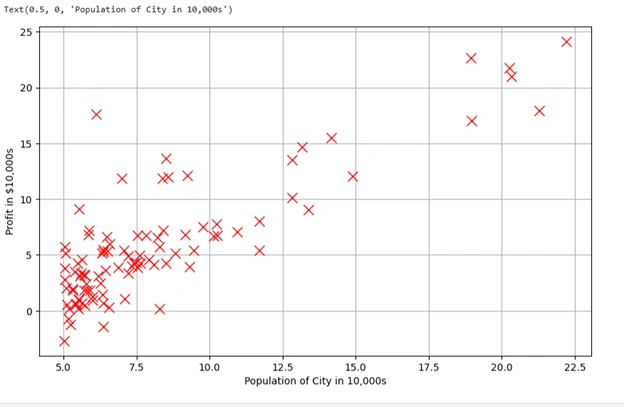
Graph 1: Linear regression scatter graph
This is a scatter plot of the given dataset, where:
Gradient descent is an optimization algorithm used to minimize the cost function in machine learning models, particularly in linear regression. It iteratively adjusts the model parameters (theta) to find the best-fit line that minimizes the error between predicted and actual values.
We are using the following codes in cells of Jupyter Notebook:
        iterations = 1500
        alpha = 0.01

        def h(theta,X): #Linear hypothesis function
            return np.dot(X,theta)

        def computeCost(mytheta,X,y): #Cost function
            """
            theta_start is an n- dimensional vector of initial theta guess
            X is matrix with n- columns and m- rows
            y is a matrix with m- rows and 1 column
            """
            #note to self: *.shape is (rows, columns)
            # return float((1./(2*m)) * np.dot((h(mytheta,X)-y).T,(h(mytheta,X)-y)))
            return float((1./(2*m)) * np.dot((h(mytheta, X) - y).T, (h(mytheta, X) - y)).item())

            #Test that running computeCost with 0's as theta returns 32.07:

            initial_theta = np.zeros((X.shape[1],1)) #(theta is a vector with n rows and 1 columns (if X has n features) )
            print(computeCost(initial_theta,X,y))
After running above codes, results are:
32.072733877455676
We have used two important parameters:
We have defined the function h(theta, X) as:
        def h(theta, X):  # Linear hypothesis function
            return np.dot(X, theta)
(h or hypothesis) by taking the dot product of
the feature matrix X and parameter vector theta.theta is set to all zeros.The function computeCost(mytheta, X, y) calculates the Mean Squared Error (MSE),
which quantifies how far the model’s predictions are from actual values.
      def computeCost(mytheta, X, y):  # Cost function
          return float((1./(2*m)) * np.dot((h(mytheta, X) - y).T, (h(mytheta, X) - y)).item())
h(mytheta, X) - y calculates the difference between predicted and actual values.m is the number of training samples.
          initial_theta = np.zeros((X.shape[1],1))
          print(computeCost(initial_theta, X, y))
initial_theta is initialized with zeros.32.0727, meaning that with
untrained parameters (all zeros), the average squared error is 32.07.We run the following codes in the cells of Jupyter Notebook:
              #Actual gradient descent minimizing routine
              def descendGradient(X, theta_start=np.zeros(2)):
                  theta = theta_start
                  jvec = []  # Stores cost values for each iteration
                  thetahistory = []  # Stores theta updates for visualization

                  for _ in range(iterations):  # Use range instead of xrange
                      tmptheta = theta.copy()  # Explicitly copy theta
                      jvec.append(computeCost(theta, X, y))
                      thetahistory.append(list(theta[:, 0]))

                      for j in range(len(tmptheta)):
                          tmptheta[j] = theta[j] - (alpha / m) * np.sum((h(theta, X) - y) * np.array(X[:, j]).reshape(m, 1))
                      theta = tmptheta
                  return theta, thetahistory, jvec


                  #Actually run gradient descent to get the best-fit theta values
                  initial_theta = np.zeros((X.shape[1],1))
                  theta, thetahistory, jvec = descendGradient(X,initial_theta)

                  #Plot the convergence of the cost function
                  def plotConvergence(jvec):
                      plt.figure(figsize=(10,6))
                      plt.plot(range(len(jvec)),jvec,'bo')
                      plt.grid(True)
                      plt.title("Convergence of Cost Function")
                      plt.xlabel("Iteration number")
                      plt.ylabel("Cost function")
                      dummy = plt.xlim([-0.05*iterations,1.05*iterations])
                      #dummy = plt.ylim([4,8])

                  plotConvergence(jvec)
                  dummy = plt.ylim([4,7])
After running above codes, results are:
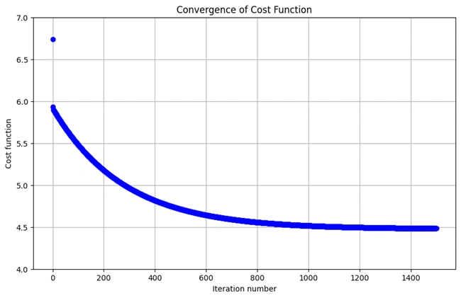
Graph 2: Showing how costs are decreasing with the increase of training iteration
We run the following codes in the cells of Jupyter Notebook:
      #Plot the line on top of the data to ensure it looks correct
      def myfit(xval):
          return theta[0] + theta[1]*xval
      plt.figure(figsize=(10,6))
      plt.plot(X[:,1],y[:,0],'rx',markersize=10,label='Training Data')
      #plt.plot(X[:,1],myfit(X[:,1]),'b-',label = 'Hypothesis: h(x) = %0.2f + %0.2fx'%(theta[0],theta[1]))

      plt.plot(X[:,1], myfit(X[:,1]), 'b-',
               label = 'Hypothesis: h(x) = %0.2f + %0.2fx' % (theta[0].item(), theta[1].item()))

      plt.grid(True) #Always plot.grid true!
      plt.ylabel('Profit in $10,000s')
      plt.xlabel('Population of City in 10,000s')
      plt.legend()
After running the above codes, the following graph is drawn:
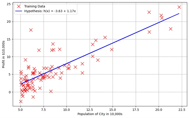
Graph 3: Showing Linear Regression Best-Fit Line Over Training Data
This graph represents the fitted linear regression model plotted over the training data. The objective is to visualize how well the model captures the relationship between the population of a city and its profit.
We run the following codes in the cells of Jupyter Notebook:
            #Import necessary matplotlib tools for 3d plots
            from mpl_toolkits.mplot3d import axes3d, Axes3D
            from matplotlib import cm
            import itertools

            fig = plt.figure(figsize=(12,12))
            #ax = fig.gca(projection='3d')
            ax = fig.add_subplot(111, projection='3d')


            xvals = np.arange(-10,10,.5)
            yvals = np.arange(-1,4,.1)
            myxs, myys, myzs = [], [], []
            for david in xvals:
            for kaleko in yvals:
              myxs.append(david)
              myys.append(kaleko)
              myzs.append(computeCost(np.array([[david], [kaleko]]),X,y))

            scat = ax.scatter(myxs,myys,myzs,c=np.abs(myzs),cmap=plt.get_cmap('YlOrRd'))

            plt.xlabel(r'$\theta_0$',fontsize=30)
            plt.ylabel(r'$\theta_1$',fontsize=30)
            plt.title('Cost (Minimization Path Shown in Blue)',fontsize=30)
            plt.plot([x[0] for x in thetahistory],[x[1] for x in thetahistory],jvec,'bo-')
            plt.show()
The following 3D Visualization Graph is generated:
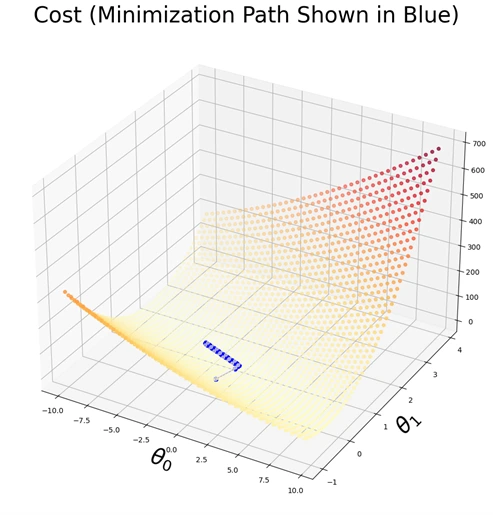
Graph 4: 3D Visualization of the Cost function
This 3D plot represents the cost function \( J(θ) \) with respect to the parameters \( θ0 \)
and \( θ1 \). The surface demonstrates how the cost varies across different parameter values, with
the color intensity indicating the magnitude of the cost. The blue trajectory
illustrates the optimization path taken by the gradient descent algorithm as it
iteratively minimizes the cost, converging toward the optimal parameter values.
This graph provides a visual representation of the cost function landscape in a three-dimensional
space. The X and Y axes correspond to the parameter values \( θ0 \)and \( θ1 \), while the
Z-axis represents the computed cost \( J(θ) \). The scattered points on the surface denote
different cost values, color-coded to indicate their magnitude. The plotted blue path
shows the step-by-step progression of gradient descent as it moves towards the minimum cost.
This visualization is crucial for understanding how gradient descent optimizes the
parameters and ensures convergence towards the best-fit hypothesis.
We have run the following codes in a cell of Jupyter Notebook:
          datafile = r'd:\mlprojects\data\ex1data2.txt'
          #Read into the data file
          cols = np.loadtxt(datafile,delimiter=',',usecols=(0,1,2),unpack=True) #Read in comma separated data
          #Form the usual "X" matrix and "y" vector
          X = np.transpose(np.array(cols[:-1]))
          y = np.transpose(np.array(cols[-1:]))
          m = y.size # number of training examples
          #Insert the usual column of 1's into the "X" matrix
          X = np.insert(X,0,1,axis=1)

          #CODES IN CELL 11
          #Quick visualize data
          plt.grid(True)
          plt.xlim([-100,5000])
          dummy = plt.hist(X[:,0],label = 'col1')
          dummy = plt.hist(X[:,1],label = 'col2')
          dummy = plt.hist(X[:,2],label = 'col3')
          plt.title('Clearly we need feature normalization.')
          plt.xlabel('Column Value')
          plt.ylabel('Counts')
          dummy = plt.legend()
The following bar graphs are generated
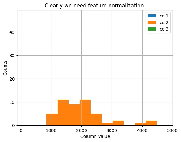
Graph 5: Distribution of Feature Values Before Normalization
Feature scaling is crucial for gradient descent optimization. This histogram represents the dataset
before normalization.
The histogram visualizes the distribution of feature values in the dataset before
applying feature normalization. The three histograms correspond to different columns of the
dataset, showing a wide range of values. The need for feature scaling is evident, as the
features vary significantly in magnitude, which can impact the performance of
gradient descent.
This figure illustrates the distribution of dataset features before normalization. The X-axis
represents the feature values, while the Y-axis indicates the count of occurrences. The histograms
for different columns show that some feature values are much larger than others and all of them
having the same orange color.
Since gradient descent is sensitive to feature magnitudes, feature normalization is essential
to bring all features to a similar scale. This improves convergence speed and ensures that
the optimization algorithm progresses efficiently without being dominated by features with
larger numerical ranges.
Feature Normalization (Standardization or Min-Max Scaling) is required to bring all features to the same scale.
Feature normalization carried out by modifying the codes and running in Jupyter Notebook as:
        #Feature normalizing the columns (subtract mean, divide by standard deviation)
        #Store the mean and std for later use
        #Note don't modify the original X matrix, use a copy
        stored_feature_means, stored_feature_stds = [], []
        Xnorm = X.copy()
        for icol in range(Xnorm.shape[1]):
        stored_feature_means.append(np.mean(Xnorm[:,icol]))
        stored_feature_stds.append(np.std(Xnorm[:,icol]))
        #Skip the first column
        if not icol: continue
        #Faster to not recompute the mean and std again, just used stored values
        Xnorm[:,icol] = (Xnorm[:,icol] - stored_feature_means[-1])/stored_feature_stds[-1]

        #Quick visualize the feature-normalized data
        plt.grid(True)
        plt.xlim([-5,5])
        dummy = plt.hist(Xnorm[:,0],label = 'col1')
        dummy = plt.hist(Xnorm[:,1],label = 'col2')
        dummy = plt.hist(Xnorm[:,2],label = 'col3')
        plt.title('Feature Normalization Accomplished')
        plt.xlabel('Column Value')
        plt.ylabel('Counts')
        dummy = plt.legend()
The following bar graphs are generated
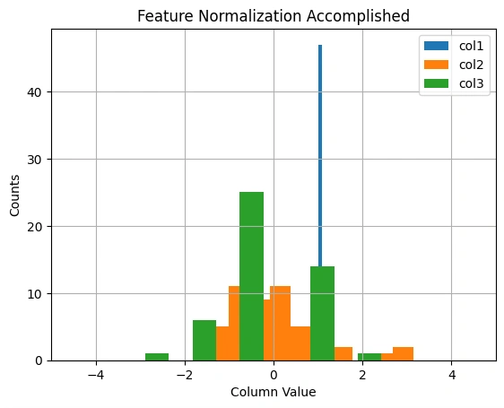
Graph 6: Distribution of Features after Normalization
Feature normalization ensures a stable and efficient training process. The transformed
features are now on a similar scale.
This histogram illustrates the distribution of feature values after applying feature
normalization. The green, orange, and blue bars represent different features of the dataset.
The transformation scales the data to a common range, ensuring that all features have a
This histogram illustrates the distribution of feature values after applying feature normalization.
The green, orange, and blue bars represent different features of the dataset. The transformation
scales the data to a common range, ensuring that all features have a mean of zero and a
standard deviation of one, which improves the efficiency of gradient descent.mean of zero
and a standard deviation of one, which improves the efficiency of gradient descent.
Normalization Process: The code normalizes each column in the dataset X by
subtracting the column mean and dividing by the standard deviation. This process ensures
that each column has a mean of 0 and a standard deviation of 1.
Storage of Means and Stds: The code calculates the mean and standard deviation
for each column in X and stores them in stored_feature_means and stored_feature_stds
for later use.
Normalization: The Xnorm array stores the normalized values. Each column (except the first) in Xnorm is adjusted using the corresponding mean and standard deviation from stored_feature_means and stored_feature_stds.
Feature normalization is a crucial preprocessing step in machine learning, particularly for gradient descent optimization. This figure visualizes the effect of normalization on feature values.
This step ensures that features contribute equally to the learning process, preventing any single feature from dominating the optimization.
Feature normalization is critical in gradient descent, especially with multiple variables, because it ensures that all features (columns of Xnorm) are on a similar scale. Without normalization, the gradient steps could be uneven or "overflow" could occur during multiplication, making the algorithm fail.
Codes for convergence:
        #Run gradient descent with multiple variables, initial theta still set to zeros
        #(Note! This doesn't work unless we feature normalize! "overflow encountered in multiply")
        initial_theta = np.zeros((Xnorm.shape[1],1))
        theta, thetahistory, jvec = descendGradient(Xnorm,initial_theta)

        #Plot convergence of cost function:
        plotConvergence(jvec)
After running the codes the following graph is generated:
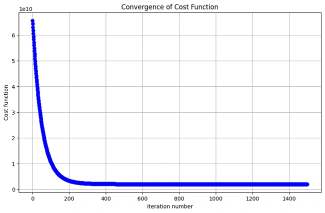
Graph 7: Convergence of the Cost Function in Multi-Variable Gradient Descent
Gradient descent minimizes the cost function iteratively. This graph shows the decrease in cost over time.
This plot illustrates the convergence behavior of the cost function over multiple iterations of gradient descent. The curved trajectory, resembling a right angle, indicates a rapid initial decrease in cost, followed by a gradual stabilization as the algorithm approaches the optimal parameters.
In multi-variable linear regression, gradient descent optimizes the cost function by iteratively updating model parameters. This figure visualizes the process:
This graph confirms that the gradient descent algorithm is functioning correctly, efficiently minimizing the cost function to improve model accuracy.
The bend line graph shows how the cost function decreases during the gradient descent process. Over time, as the algorithm converges, the cost approaches its minimum, which is where the model parameters (theta) are optimized.
I sincerely thank Prof. Andrew NG (DeepLearning.AI, Stanford University) for his inspiring courses that laid the foundation for this project.
 www.HoqueAi.com