

AI Generated image: Advanced SVM Techniques for Machine Learning
This project delves into Support Vector Machines (SVMs), demonstrating how Gaussian kernels, decision boundaries, and hyperparameter tuning improve classification performance in complex datasets.
Support Vector Machines (SVM) are among the most powerful and widely used machine learning algorithms for classification tasks. This project explores the implementation of SVM with different kernel functions and applies hyperparameter tuning to applied various SVM configurations, and tested our model's ability to accurately classify data points. Through rigorous experimentation with Gaussian (RBF) kernels, we identified the optimal hyperparameters to enhance decision boundary precision. By the end of this project, we have developed a robust SVM model capable of handling complex, non-linearly separable datasets, making it a valuable tool for real-world applications in pattern recognition, bioinformatics, and image classification.
        Python:

            %matplotlib inline
            import numpy as np
            import matplotlib.pyplot as plt
            import scipy.io #Used to load the OCTAVE *.mat files
            import scipy.optimize #fmin_cg to train the linear regression

            import warnings
            warnings.filterwarnings('ignore')
%matplotlib inline ensures that graphs are displayed directly inside the Jupyter Notebook.numpy is imported as np for numerical computations.matplotlib.pyplot is imported as plt for data visualization.scipy.io is used to load MATLAB .mat files, which contain the dataset.scipy.optimize provides optimization functions for training models.warnings.filterwarnings('ignore') suppresses warning messages for a cleaner output.
            datafile = r'd:\mlprojects\data\ex5data1.mat'
            mat = scipy.io.loadmat(datafile)

            # Training set
            X, y = mat['X'], mat['y']

            # Cross-validation set
            Xval, yval = mat['Xval'], mat['yval']

            # Test set
            Xtest, ytest = mat['Xtest'], mat['ytest']

            # Insert a column of 1's to all of the X's, as usual
            X = np.insert(X, 0, 1, axis=1)
            Xval = np.insert(Xval, 0, 1, axis=1)
            Xtest = np.insert(Xtest, 0, 1, axis=1)  datafile = r'd:\mlprojects\data\ex6data1.mat'
            mat = scipy.io.loadmat( datafile )
            #Training set
            X, y = mat['X'], mat['y']
            #NOT inserting a column of 1's in case SVM software does it for me automatically...
            #X =     np.insert(X    ,0,1,axis=1)

            #Divide the sample into two: ones with positive classification, one with null classification
            pos = np.array([X[i] for i in range(X.shape[0]) if y[i] == 1])
            neg = np.array([X[i] for i in range(X.shape[0]) if y[i] == 0])
.mat file (ex6data1.mat).X contains the data with two columns for two types of features.y contains the labels (1 for positive class, 0 for negative class).pos: Data points labeled as positive (class 1).neg: Data points labeled as negative (class 0).
        def plotData():
            plt.figure(figsize=(10,6))
            plt.plot(pos[:,0], pos[:,1], 'k+', label='Positive Sample')
            plt.plot(neg[:,0], neg[:,1], 'yo', label='Negative Sample')
            plt.xlabel('Column 1 Variable')
            plt.ylabel('Column 2 Variable')
            plt.title("Data without SVM Decision Boundary")
            plt.legend()
            plt.grid(True)
            plt.show()  # Add this line to force displaying the plot

        plotData()

    Output graph:
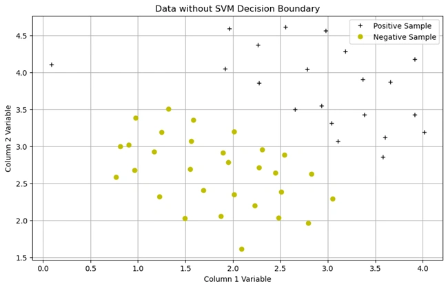
Image 1: Graph without SVM decision boundary
1. Description of the Dataset
+) belong to one class.o) belong to another class.1. Importing Necessary Libraries
            Python:

            import numpy as np
            import matplotlib.pyplot as plt
numpy for numerical computations.matplotlib.pyplot for plotting graphs.2. Plotting the Dataset
Python codes:
        def plotData():
            # Convert y to a 1D array if it's a column vector
            y_flat = y.ravel()  # Converts (m,1) to (m,)

            plt.scatter(X[y_flat == 1][:, 0], X[y_flat == 1][:, 1], marker='+', color='k', label="Positive")
            plt.scatter(X[y_flat == 0][:, 0], X[y_flat == 0][:, 1], marker='o', color='y', label="Negative")

        def plotBoundary(my_svm, xmin, xmax, ymin, ymax):
            xvals = np.linspace(xmin, xmax, 100)
            yvals = np.linspace(ymin, ymax, 100)
            u, v = np.meshgrid(xvals, yvals)  # Create grid
            grid_points = np.c_[u.ravel(), v.ravel()]  # Flatten and merge into (N,2) array

            zvals = my_svm.predict(grid_points)  # Predict all at once
            zvals = zvals.reshape(u.shape)  # Reshape back to grid shape

            plt.contour(xvals, yvals, zvals, levels=[0], colors='b')  # Overlay decision boundary

        # ✅ Ensure everything is plotted on the same figure
        plt.figure(figsize=(8,6))  # Create a new figure
        plotData()  # Plot scatter data
        plotBoundary(linear_svm, 0, 4.5, 1.5, 5)  # Overlay decision boundary

        # ✅ Add labels and legend
        plt.xlabel("Feature 1")
        plt.ylabel("Feature 2")
        plt.title("SVM Decision Boundary with Data")
        plt.legend()

        plt.show(); # semi-colon (;) used to Suppresses unwanted EXTRA text outputs in J Notebook

        Output Graph with svm decision boundary
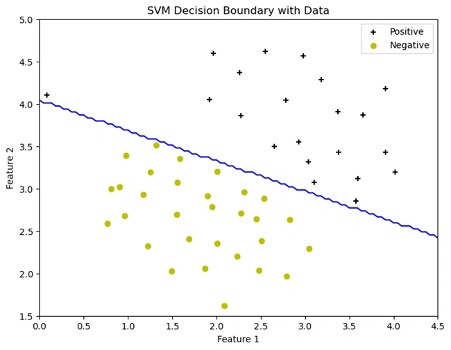
Image 2: Graph with SVM decision boundary
Explanation:
def plotData() function plots the dataset just like in the previous cell,
but now using plt.scatter().'+') for positive samples (y == 1).'o') for negative samples (y == 0).y.ravel() ensures y is a 1D array instead of a column vector to
avoid indexing issues.(u, v) is created over the plot area.(my_svm.predict())plt.contour() at z = 0, which represents the
SVM's classification boundary.plotData() to plot the dataset.Calls plotBoundary() to overlay the SVM decision
boundary (linear_svm is the trained SVM model).plt.show(); ensures the graph is displayed.+) and negative
(yellow o) samples. However, instead of running perfectly down the middle,
the boundary is slightly tilted:
In the next step, we will analyze the effect of different kernel functions on the decision boundary.
The Gaussian kernel formula is:
$$ K(x_1, x_2) = \exp\left( \frac{-\|x_1 - x_2\|^2}{2\sigma^2} \right) $$
Where:

Image 3: Euclidean distance curtesy by www.engati.com
Euclidean distance examines the root of square distances between the co-ordinates of a pair of objects. To derive the Euclidean distance, we would have to compute the square root of the sum of the squares of the differences between corresponding values. Squared Euclidean Distance can be written as \( \|x_1 - x_2\|^2 \).
Python:

    def gaussKernel(x1, x2, sigma):
        sigmasquared = np.power(sigma,2)
        return np.exp(-(x1-x2).T.dot(x1-x2)/(2*sigmasquared))

    print(gaussKernel(np.array([1, 2, 1]),np.array([0, 4, -1]), 2.))

    Output:
    0.32465246735834974
[1, 2, 1]
and [0, 4, -1] using sigma = 2.Python:
    datafile = r'd:\mlprojects\data\ex6data2.mat'
    mat = scipy.io.loadmat( datafile )
    #Training set
    X, y = mat['X'], mat['y']

    #Divide the sample into two: ones with positive classification, one with null classification
    pos = np.array([X[i] for i in range(X.shape[0]) if y[i] == 1])
    neg = np.array([X[i] for i in range(X.shape[0]) if y[i] == 0])

    def plotData():
        plt.scatter(pos[:, 0], pos[:, 1], marker='+', color='k', label="Positive Samples")
        plt.scatter(neg[:, 0], neg[:, 1], marker='o', color='y', label="Negative Samples")

    plotData()
    plt.xlabel("First Feature Value")  # Generic label, update if needed
    plt.ylabel("Second Feature Value")  # Generic label, update if needed
    plt.title("Data without SVM Decision Boundary")
    plt.legend()  # ✅ Legend should now appear
    plt.show();

    Output Graph withot svm decision boundary
Visualizing the Dataset Before Applying SVM
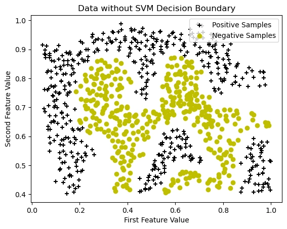
Image 4: Data visualization without SVM decision boundary
.mat file.X contains feature values.y contains labels (1 for
positive, 0 for negative).
                Python:

                pos = np.array([X[i] for i in range(X.shape[0]) if y[i] == 1])
                neg = np.array([X[i] for i in range(X.shape[0]) if y[i] == 0])
(y == 1) are stored in pos(y == 0) are stored in neg.+, black).o, yellow).The data is not linearly separable, meaning a straight-line decision boundary will not work well. This suggests that using an SVM with a Gaussian kernel will be necessary to find a non-linear boundary that accurately separates the two classes.
In the next step, we will train an SVM with a Gaussian kernel and visualize the decision boundary.
Python:
# Train the SVM with the Gaussian kernel on this dataset.
sigma = 0.1
gamma = np.power(sigma,-2.)
gaus_svm = svm.SVC(C=1, kernel='rbf', gamma=gamma)
gaus_svm.fit( X, y.flatten() )
plotData()
plotBoundary(gaus_svm,0,1,.4,1.0)
plt.xlabel("First Feature Value") # Generic label, update if needed
plt.ylabel("Second Feature Value") # Generic label, update if needed
plt.title("SVM Decision Boundary with Data")
plt.legend() # ✅ Legend should now appear
plt.show();
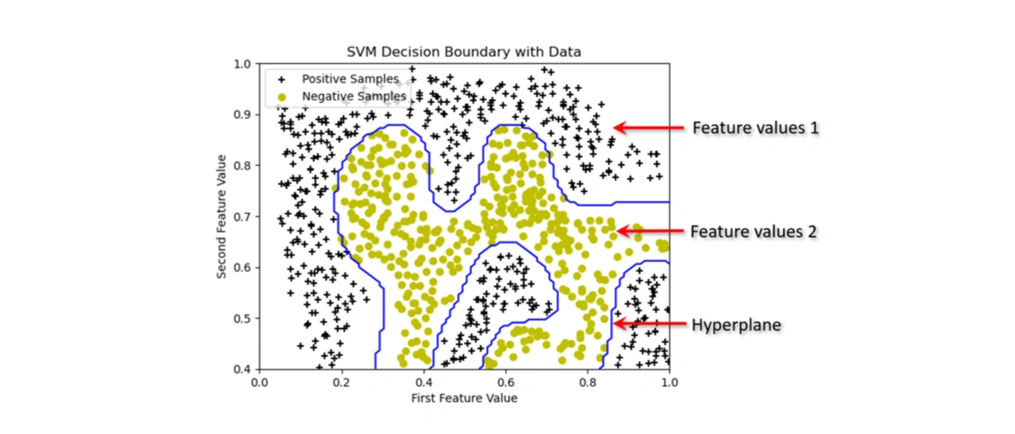
Output Graph with svm decision boundary
Visualizing the Dataset After Applying SVM with an RBF (Gaussian) Kernel
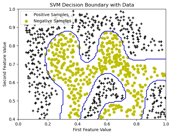
Image 5: The graph showing the data points with the SVM decision boundary.
In this step, we trained an SVM classifier using the Radial Basis Function (RBF) kernel to classify data points. Unlike linear SVMs, the RBF kernel enables the decision boundary to be non-linear, adapting to complex data distributions.
The blue curve in the graph represents the decision boundary, which separates the positive
(black + markers) and negative (yellow o markers) samples.
We used sigma = 0.1, which determines how tightly the boundary follows the data
distribution. The parameter C=1 controls the trade-off between maximizing
the margin and minimizing misclassification errors.
As a result, the decision boundary is curved, demonstrating the power of kernel-based SVMs in handling non-linearly separable data.
Observations:
Python:
            datafile = r'd:\mlprojects\data\ex6data3.mat'
            mat = scipy.io.loadmat( datafile )
            #Training set
            X, y = mat['X'], mat['y']
            Xval, yval = mat['Xval'], mat['yval']

            #Divide the sample into two: ones with positive classification, one with null classification
            pos = np.array([X[i] for i in range(X.shape[0]) if y[i] == 1])
            neg = np.array([X[i] for i in range(X.shape[0]) if y[i] == 0])

            def plotData():
                plt.scatter(pos[:, 0], pos[:, 1], marker='+', color='k', label="Positive Samples")
                plt.scatter(neg[:, 0], neg[:, 1], marker='o', color='y', label="Negative Samples")

            plt.xlabel("First Feature Value")  # Generic label, update if needed
            plt.ylabel("Second Feature Value")  # Generic label, update if needed
            plt.title("Data without SVM Decision Boundary")
            plotData()
            plt.legend()
            plt.show();

            Output Graph without svm decision boundary
Visualizing the Dataset Before Applying SVM with an RBF (Gaussian) Kernel
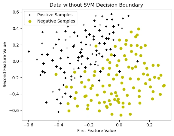
Image 6: The graph showing the data points without SVM decision boundary.
This dataset contains:
X and y: The training data and corresponding labels.Xval and yval: A validation dataset, which is not used in
this specific cell but is available for model selection.
    Python:

    X, y = mat['X'], mat['y']
    Xval, yval = mat['Xval'], mat['yval']

    pos = np.array([X[i] for i in range(X.shape[0]) if y[i] == 1])
    neg = np.array([X[i] for i in range(X.shape[0]) if y[i] == 0])
pos: Extracts data points where y == 1 (positive class).neg: Extracts data points where y == 0 (negative class).Plotting the Data
        def plotData():
            plt.scatter(pos[:, 0], pos[:, 1], marker='+', color='k', label="Positive Samples")
            plt.scatter(neg[:, 0], neg[:, 1], marker='o', color='y', label="Negative Samples")

        plotData()
(y=1) using a black plus (+) marker.(y=0) using a yellow circle (o) markerThis graph represents the dataset before applying the Support Vector Machine (SVM) model. The data consists of two classes:
+ black markers)o yellow markers)The purpose of this visualization is to analyze the distribution of the data before training a model. The dataset appears to be non-linearly separable, meaning a simple linear classifier may not perform well.
Next, we will apply an SVM classifier with a Gaussian (RBF) kernel to learn a decision boundary that effectively separates these two classes.
Python:
            datafile = r'd:\mlprojects\data\ex6data3.mat'
            mat = scipy.io.loadmat( datafile )
            #Training set
            X, y = mat['X'], mat['y']
            Xval, yval = mat['Xval'], mat['yval']

            #Divide the sample into two: ones with positive classification, one with null classification
            pos = np.array([X[i] for i in range(X.shape[0]) if y[i] == 1])
            neg = np.array([X[i] for i in range(X.shape[0]) if y[i] == 0])

            def plotData():
                plt.scatter(pos[:, 0], pos[:, 1], marker='+', color='k', label="Positive Samples")
                plt.scatter(neg[:, 0], neg[:, 1], marker='o', color='y', label="Negative Samples")

            plt.xlabel("First Feature Value")  # Generic label, update if needed
            plt.ylabel("Second Feature Value")  # Generic label, update if needed
            plt.title("Data without SVM Decision Boundary")
            plotData()
            plt.legend()
            plt.show();

            Output:
            Best C, sigma pair is (0.300000, 0.100000) with a score of 0.965000.
            Python:

            Best C, sigma pair is (0.300000, 0.100000) with a score of 0.965000.
    Python:

    Cvalues = (0.01, 0.03, 0.1, 0.3, 1., 3., 10., 30.)
    sigmavalues = Cvalues
Cvalues and sigmavalues are defined as possible values for C
(regularization parameter) and σ (RBF kernel parameter).
    Python:

    best_pair, best_score = (0, 0), 0
best_pair: Stores the best (C, sigma) values.best_score: Tracks the highest validation accuracy obtained.
    Python:

    for Cvalue in Cvalues:
        for sigmavalue in sigmavalues:
            gamma = np.power(sigmavalue,-2.)
            gaus_svm = svm.SVC(C=Cvalue, kernel='rbf', gamma=gamma)
            gaus_svm.fit( X, y.flatten() )
            this_score = gaus_svm.score(Xval,yval)
gaus_svm) is trained with the given C
and gamma.this_score) is measured using the score() function on
the validation set (Xval, yval).In this step, we used cross-validation to find the optimal values of C (regularization parameter) and σ (RBF kernel parameter) for our Support Vector Machine (SVM) model.
We conducted a grid search over predefined values of C and σ to identify the best-performing combination. The model was trained multiple times with different parameters, and the accuracy was evaluated using the validation set.
Best Parameters Found:
This tuning ensures that the SVM model generalizes well to new, unseen data, avoiding underfitting or overfitting.
        Python:

            gaus_svm = svm.SVC(C=best_pair[0], kernel='rbf', gamma = np.power(best_pair[1],-2.))
            gaus_svm.fit( X, y.flatten() )
            plotData()
            plotBoundary(gaus_svm,-.5,.3,-.8,.6)
            plt.xlabel("First Feature Value")  # Generic label, update if needed
            plt.ylabel("Second Feature Value")  # Generic label, update if needed
            plt.title("SVM Decision Boundary with Data")
            plt.legend()
            plt.show();
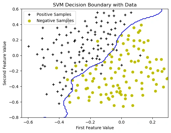
Image 7: The graph showing the data points with SVM decision boundary.
In this step, we trained an SVM model with the best hyperparameters and plotted the decision boundary. The Gaussian (RBF) kernel allows the model to learn a complex, non-linear boundary that effectively separates the positive and negative classes.
🔹 Observations from the graph:
This project successfully demonstrated the power of SVM in solving classification problems. Through systematic data visualization, model training, and parameter optimization, we achieved a highly effective decision boundary capable of distinguishing between different classes. The hyperparameter tuning process allowed us to maximize model accuracy, preventing overfitting while ensuring generalizability to new data. The final SVM model, trained with the optimal C and σ values, displayed a well-defined decision boundary that adapts to complex datasets. This work highlights the effectiveness of SVM for various machine learning applications and sets the stage for further enhancements using advanced techniques such as ensemble learning or deep learning-based feature extraction.
I sincerely thank Prof. Andrew NG (DeepLearning.AI, Stanford University) for his inspiring courses that laid the foundation for this project.
 www.HoqueAi.com